this post was submitted on 26 Mar 2024
192 points (88.1% liked)
MapPorn
3067 readers
1 users here now
Discover Cartographic Marvels and Navigate New Worlds!
Rules
- Be respectful and inclusive.
- No harassment, hate speech, or trolling.
- Engage in constructive discussions.
- Share relevant content.
- Follow guidelines and moderators' instructions.
- Use appropriate language and tone.
- Report violations.
- Foster a continuous learning environment.
founded 1 year ago
MODERATORS
you are viewing a single comment's thread
view the rest of the comments
view the rest of the comments
You needed to explain that for it to make sense
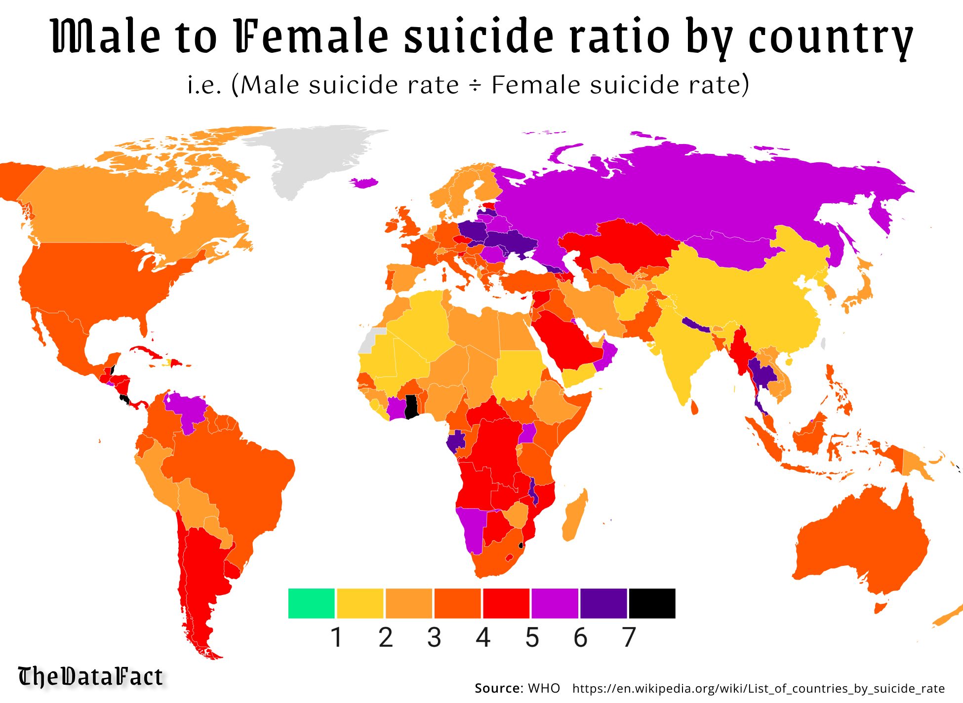
That's the point of the color bar on the bottom, a part of any good graph
The color bar means nothing without any label.
The numbers, right there on the bar, and the text at the top of the image.
"male to female suicide ratio" and then the numbers 1-10, it even explains that it's (men's suicides / women's suicides) so anyone who doesn't know what a ratio is can enjoy as well
Does this help?
It does but if it was good it wouldn’t need an explanation.
The title explains it... If it isn't clear by that, it explains what that means in the text below. That my explanation was necessary is not really the fault of the infographic
I disagree.
I agree with the OP. You're bad at reading graphs, unfortunately
Apparently I’m not the only one since this thread was started by someone else who was confused. And should you have to be good at reading graphs to understand one? They should present the information in a clear easy to understand manner. This failed at that.