this post was submitted on 13 Jan 2024
489 points (92.1% liked)
memes
10959 readers
2875 users here now
Community rules
1. Be civil
No trolling, bigotry or other insulting / annoying behaviour
2. No politics
This is non-politics community. For political memes please go to !politicalmemes@lemmy.world
3. No recent reposts
Check for reposts when posting a meme, you can only repost after 1 month
4. No bots
No bots without the express approval of the mods or the admins
5. No Spam/Ads
No advertisements or spam. This is an instance rule and the only way to live.
Sister communities
- !tenforward@lemmy.world : Star Trek memes, chat and shitposts
- !lemmyshitpost@lemmy.world : Lemmy Shitposts, anything and everything goes.
- !linuxmemes@lemmy.world : Linux themed memes
- !comicstrips@lemmy.world : for those who love comic stories.
founded 2 years ago
MODERATORS
you are viewing a single comment's thread
view the rest of the comments
view the rest of the comments

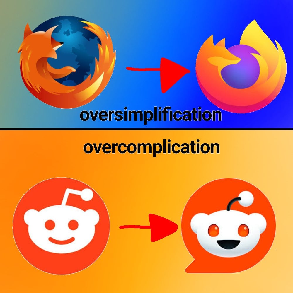
I like it too, the old one was too detailed which makes it stand out too much. Icons need to work in a lot of contexts so simpler is almost always better.
The old one was great – in the context of late 00s to early 2010s design philosophy. It fit right in with Apple‘s skeumorphic design language and Microsofts Aero design. The new one is the perfect answer to the modern, more minimalist design. (Although I’m glad we’re mostly out of the "flat“ design era of Windows Metro and similar UIs)
That's true, it fit in with the trends of the time. I guess part of my feeling is that I never actually liked skeumorphic design so I've been happy that flat caught on. There was a period where it did get too flat, but I like the middle ground we're at now.
I miss Aero design so much.