orig posted on a now closed subreddit and hosted on imgur, reposting before it eventually gets deleted
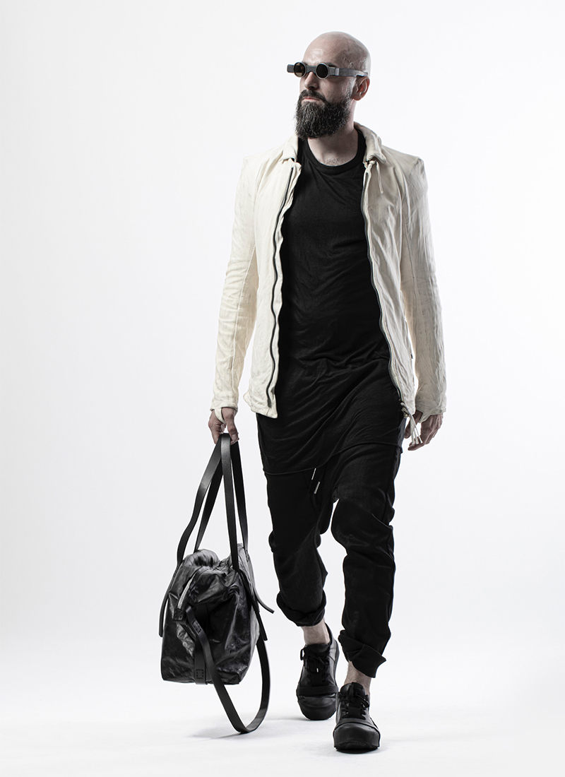
Long line tee works with cropped pant due to it's slim fit and matching color which carries the eye up and down the body. The jacket hits at a very 'normal' hip level which reminds the eye of conventional proportions allowing both proportions to exist at the same time and balance each other.
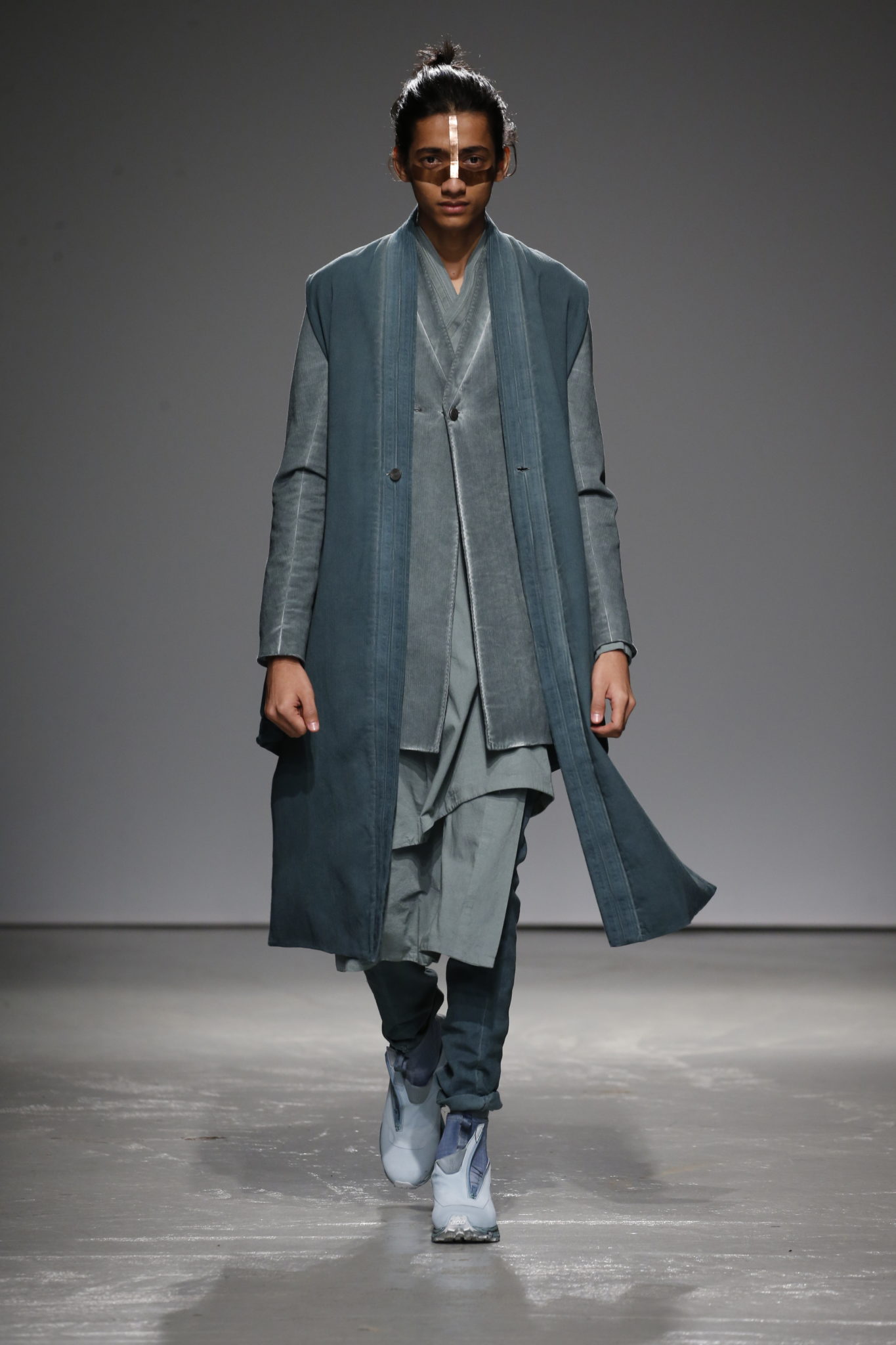
The extremely high button stance would look awkward on a standard jacket, but this fit is elongated with multiple lower breakpoints that ease the tension and allow the A-form silhouette to dominate the overall shape of the fit.
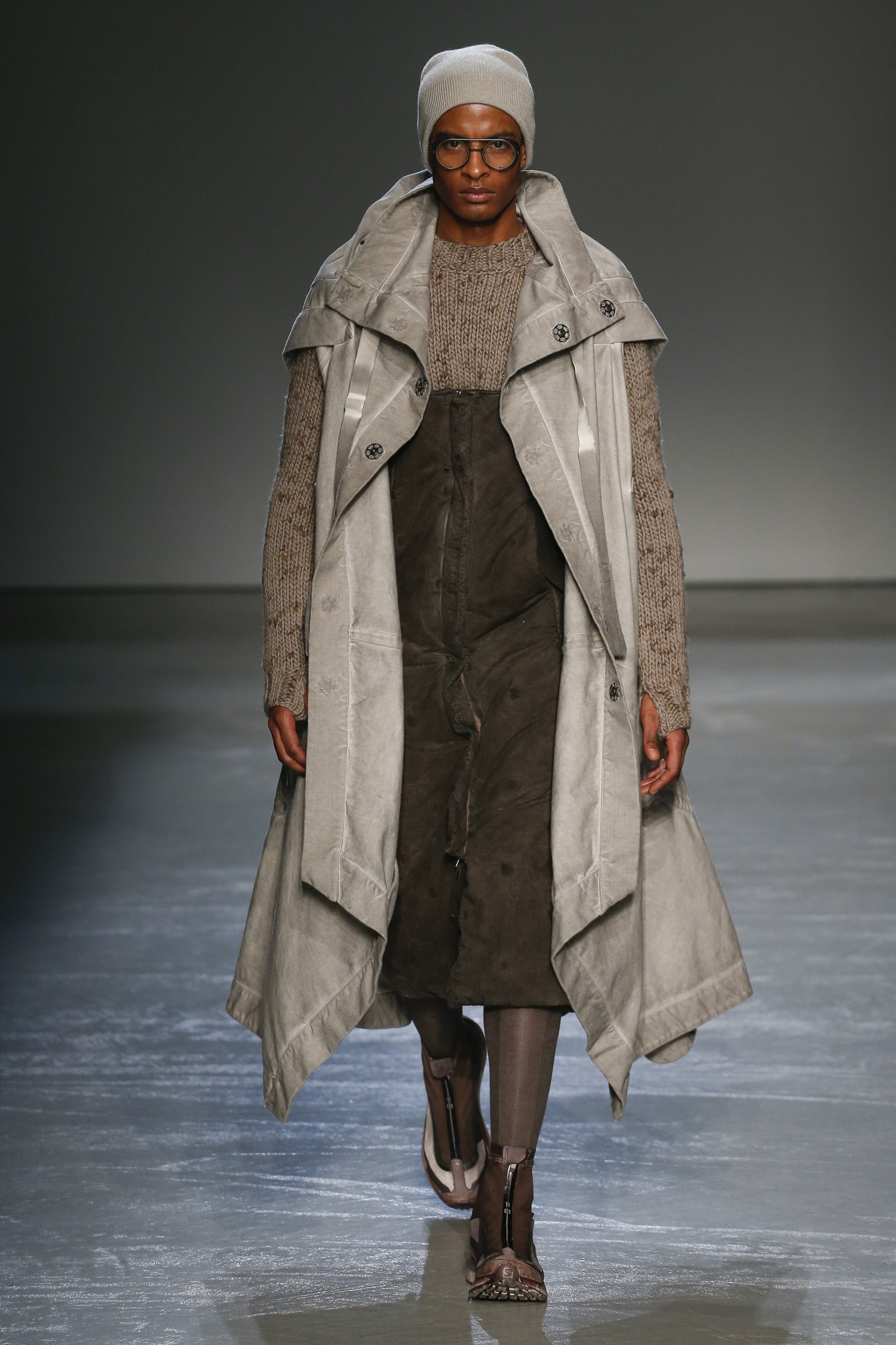
Very strange proportions here, but what you're seeing is essentially a 'negative space' bolero/shrug driven by the low cut overall and sweater combination. The dramatic coat swallows the fit which allows it to feel unified. The beanie matching the coat enhances this effect by having that grey carry the whole way up and down.
Competing proportions offer reminders of conventional horizontal breakpoints. The longline tee is restrained by the inner jacket/hoodie that hits just below the waist. The knee length parka feels even longer because the taller boots shorten the legline.
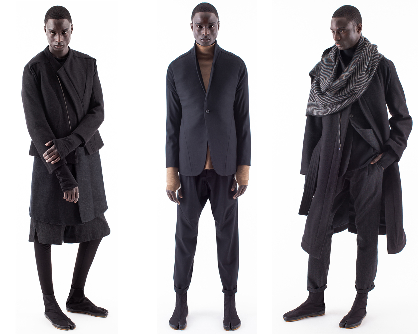
Layering changes proportions of seemingly conventional lengths. The long sleeved shirts with thumbholes make the arms look exceedingly long and in the middle option, reinforce the breakpoint helping to differentiate top and bottom blocks, while in the left they serve as another layer in an already layered look, and on the right they make a flowy fit look even more flowy.
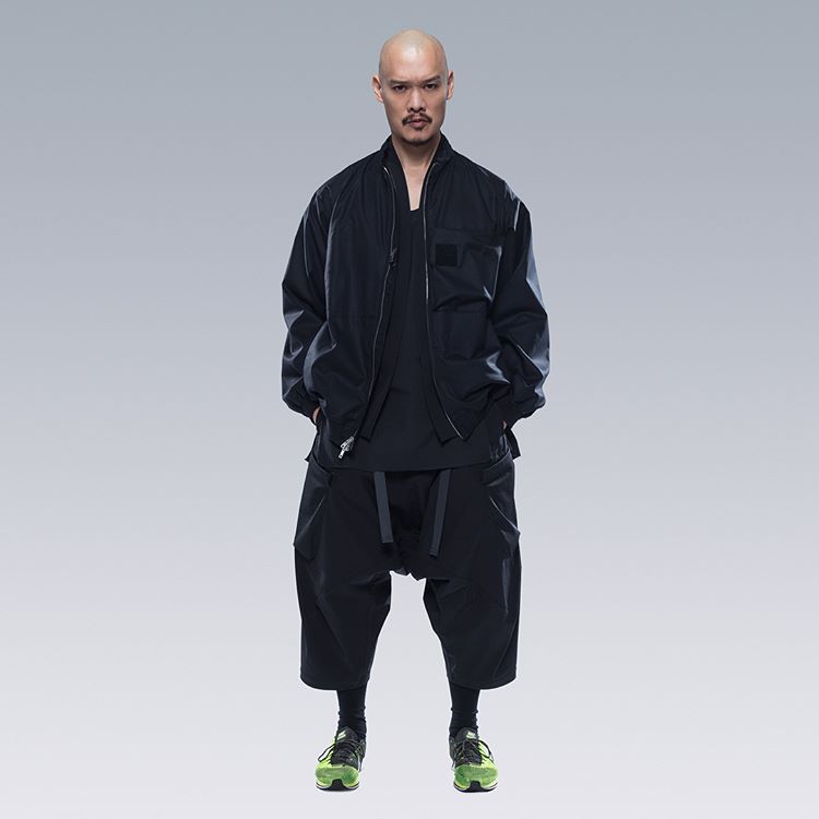
Wide block on wide block. The low cut neck and cropped pant with runners enhance the horizontal lines and make for a very compressed silhouette.
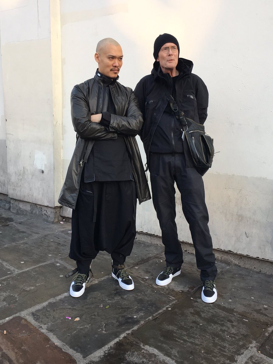
A very low drop-crotch pant with a hip length coat hugely elongates the upper body until it breaks the expected form and allows the silhouette to exist as its own shape.
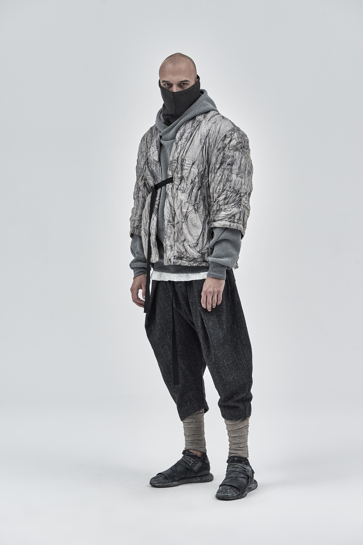
Cropped sleeve jacket and cropped pants offer an aggressive set of proportions, creating a very strong V shaped from top to bottom.
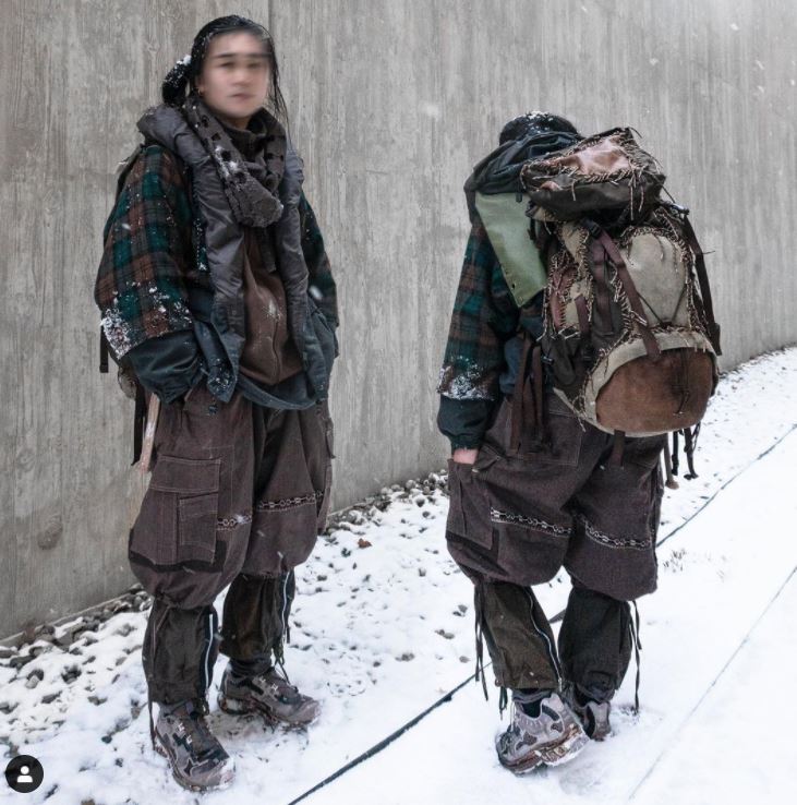
A story in 8 parts. Just kidding, but there are many breaks here which have the eye treating it as a chunky patchwork effect which is reflected in the jacket itself. The faux cropped sleeve, the rolled collar, the scarf which matches the collar, the brown sweater that matches the brown plaid in the jacket, the cargo pants tied off looking like they float over another pant. So much going on to enjoy, it shouldn't be harmonious, but it is. Expertly put together.
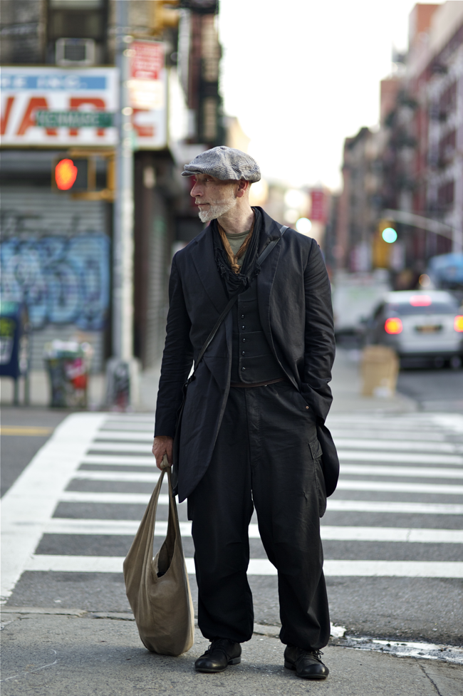
Individual pieces that shouldn't make sense in the same fit, but do because the proportions all hit right. The inner vest hits at the waist. The baggy cargos at blouse over delicate shoes and the just about knee-length coat keeps the pants from overwhelming the fitted top.
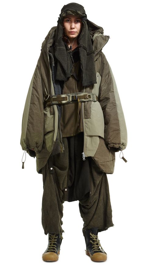
The belt being wrapped at the naval reminds the eye of where conventional lines are, which help save the massively oversized fit from swallowing it's petite wearer. The cropped pant leg with the slim sneakerboot reminds the eye of the real width of the wearer's leg. Haphazard and contained.
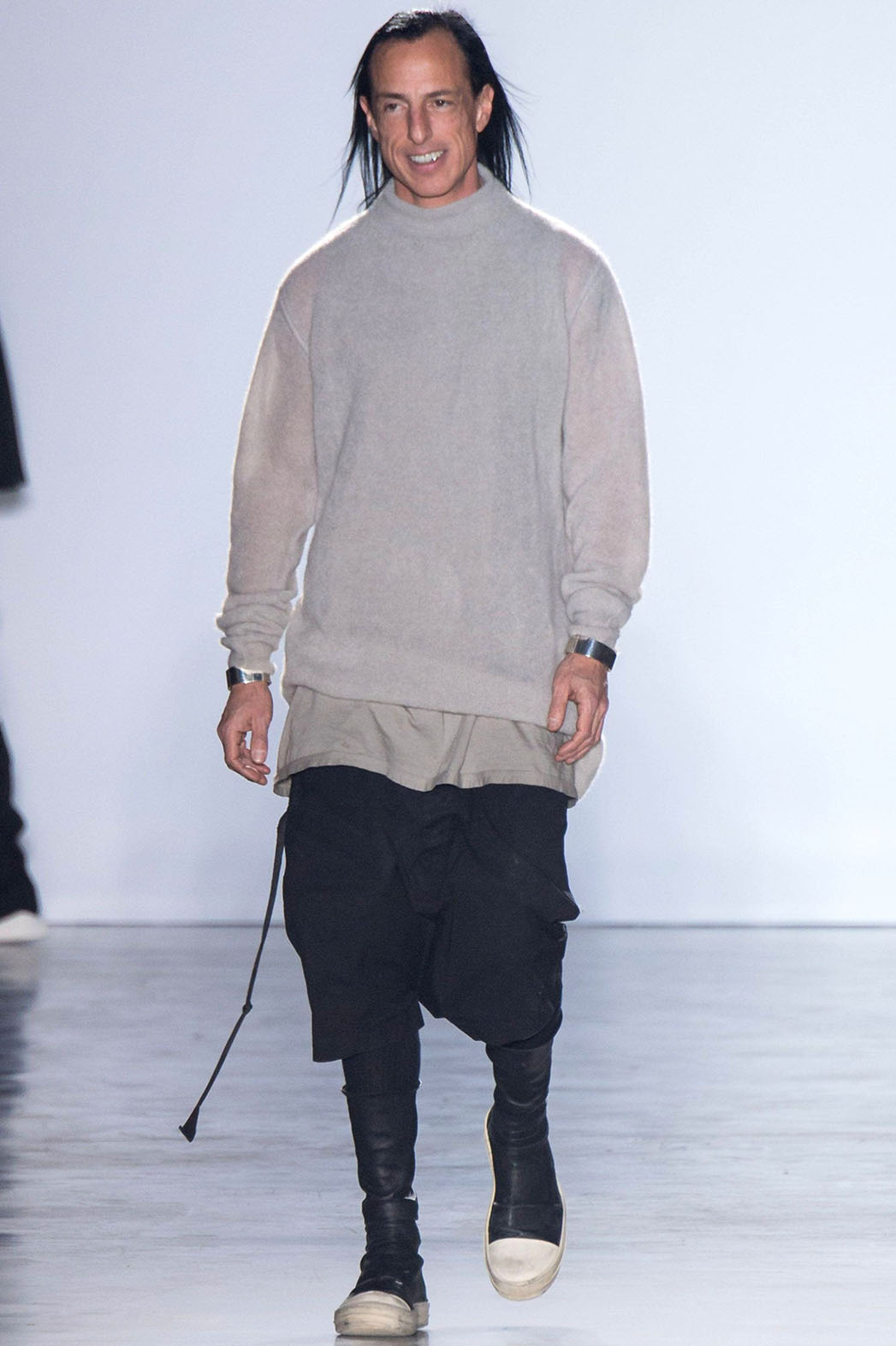
Similarly, what would be a rather shapeless fit is given a strong reminder of the leg shape via the sock boot. The topmost sweater is practically 'normal' before the lower block of the fit is split multiple times horizontally.
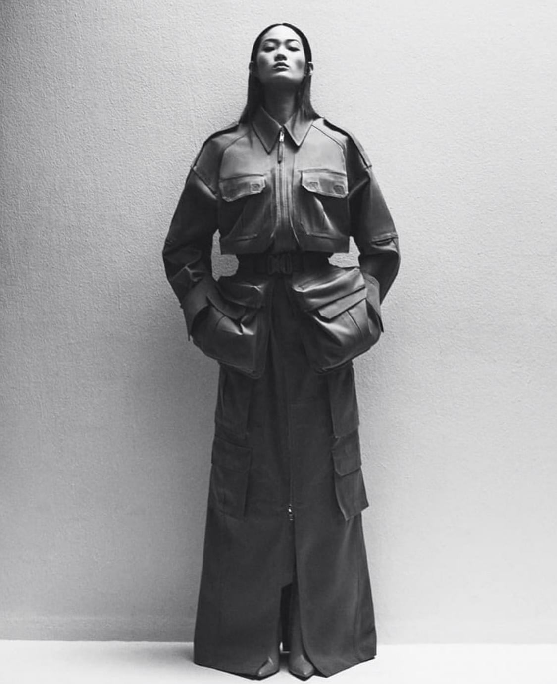
An oversized jacket is completely altered by adding a belt at the naval, greatly elongating the figure of the wearer which would have otherwise been lost if the jacket were full.
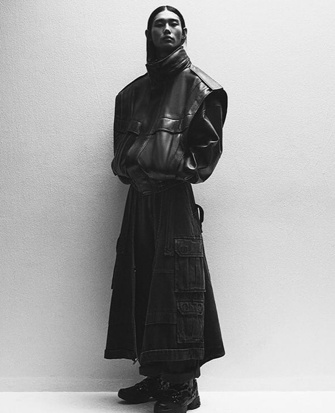
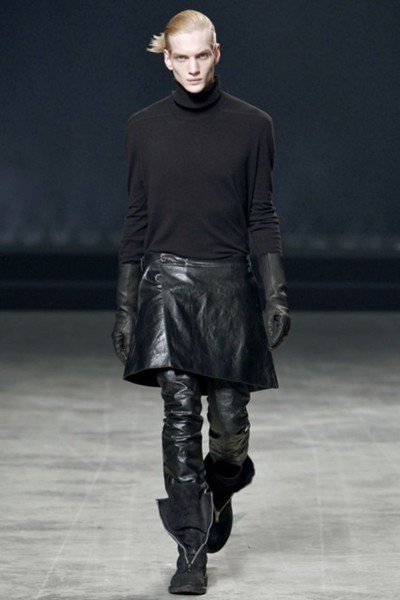
An extreme hourglass shape with the widest points at the shoulders and ankles. A tight hemline on the jacket and an A-line skirt create this abstract silhouette.
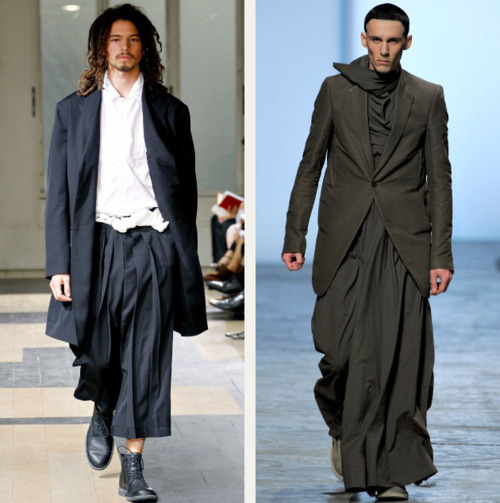
Here are examples of how outerwear is affected by what you wear beneath it rather than the opposite. The longer jacket on the left is made softer and more feminine with the loose pleated cropped pants and blouse. The jacket on the right is made more masculine (despite being quite feminine on it's own) by being paired with a dress. The mannish button stance is an amusing touch that reminds us that the jacket is a menswear piece despite everything else going on.
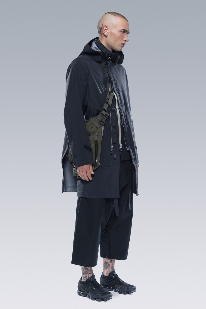
A hip length jacket paired with cropped trousers elongates the top block and shortens the legs. It's an interesting effect that is quite easy to pull off.
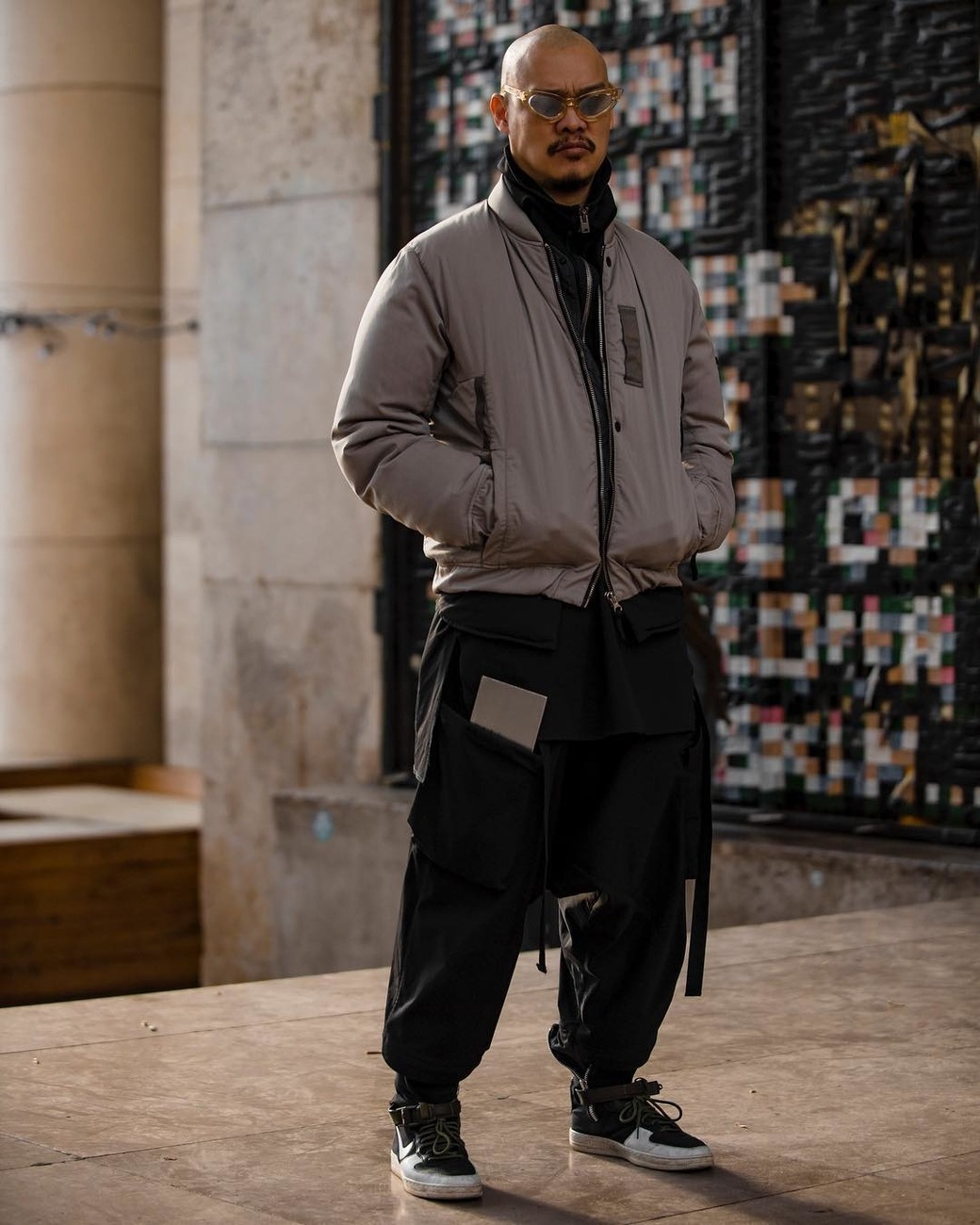
A conventional length bomber jacket over drop-crotch pants is helped along by a very long-line split hem shirt even though the the pants and shirt are the same color, the horizontal break is still there. The longline shirt diminishes the depth of the crotch length.
Pretty much anything goes, but it's hard to get there if you don't pay attention to how forms change on your body and what you pair them with.
Some basic visual breakpoints for folks to keep in mind are:
- The bottom of the chest - Think shrug/bolero length
- Navel
- Modern waist
- Hip
- Knee
- Mid-calf
- Ankle
With these breakpoints you can add layers that hit different breakpoints to create different proportions. You can use color to create or hide contrast between sections. You can vary widths to explore more complex forms. You can leverage accessories to delineate breakpoints. You can tuck, roll, and whatever else to also hit those horizontal visuals to help play with proportion and change the silhouette.
Try to think of your fit as a composition of shapes and then, you can look better in outerwear (and everything else too).
colors are for F**S and WOMEN obviously!!