Zeus

joined 1 year ago
MODERATOR OF
[–] Zeus@lemm.ee 1 points 7 months ago

well i don't really know how much you know, so i don't want to over-explain things, but:

  • data uris are basically a way of embedding a whole image in text, rather than linking to an image (i.e. src=./favicon.png). more reading. so there's no way of guessing what image to replace, you have to inspect the source of the image in the browser chrome
  • which leads me to: the browser toolbox allows you to inspect the actual browserchrome itself more reading. you can't right click → inspect to pinpoint a specific element, but you can click the "⇱" icon and select an element
  • so you'll have to inspect your own browser to find the specific string
  • ~~if the code actually did nothing (on lemmy, not amazon) you might be out of luck - it's possible firefox compresses them differently so the uri doesn't match~~ i'm an idiot, it would do nothing, it has [..] in it because the actual string is too long for a lemmy comment

do feel free to ask further questions, although my replies may be slow as i'm not really on lemmy that often

[–] Zeus@lemm.ee 2 points 8 months ago (2 children)

okay there is a way to do this in css, but

  1. it's really fucking tedious to do it for many images;
  2. i haven't tried to do it in userchrome, just normal css.
    • i just tested it with the browser toolbox, and it doesn't work, but it may do if you add it to userchrome then restart &c.

but it is less hacky than doing it with the background-image way, so if you want to try it:

  • the basic way to replace an image by its url is with content[^1]
    • so to replace your avatar with mine, use
img[src="/static/1787a77/assets/icons/icon-96x96.png"] {
	content: url("https://lemm.ee/pictrs/image/e04cf77f-b694-4a15-9633-3281efbe8157.webp")
}
  • however tab favicons use data uri's (i also don't know if they accept svg - they ought, but i'm not sure)
    • so you'd need to inspect the tab, copy the uri, and hope it never changes. lemm.ee's, at the moment, is img[src="data:image/png;base64,iVBORw0K[..]8sRwEqwGyXYQAAAABJRU5ErkJggg=="]
  • using this technique, you should be able to have (obviously use the full data uri for the match, but it's too long for a lemmy comment)
[src="data:image/png;base64,iVBORw0K[..]8sRwEqwGyXYQAAAABJRU5ErkJggg=="] {
	content: url("data:image/webp;base64,UklGRpwBAABXRUJQVlA4TI8BAAAvL8ALEI+gNpKt5CONUBD9DxGRu0tEG2pj24b+JlOH1rWjA5Fo34mMokhSnP2iAPxrwAc4QAFcDs/5DwAAwA/w3ldbUOGaa/PFlUhSTtKHXMo1SnxBLWOOcGW8HgAxttW4jtGCAn9R3H+1seFhmBQQ0X8GbtvGsWovC7r7eMSBkSRHjIyZYIjSA3OCy7GkZ7itFHpkYP0nej/k0xP6fUihtunvvL6G0jCydTrwojK20TWjImAJJqa1fVkU4Zydi49/En92lG0WTcwIzNjeOxtgottXvr19XsPVOxXXq4dGWaBh6mRc9YNM6fN2GZHQ49+SF1Htf4ZUfwiLU1grlqZwfuFVymENQ7MYw5CeRxWH9DGjnFefXa65loYRdEyFzUtfYbR2et/FbfHwWq84zvOEYWpyvBDAPAHsWQbhewqz9M5U8Q4i33LuTI/7EkAF7hBWKvXgpeS2cKflcB6sHFiU4N66AoZFZQS+lXxXhUd3X6p19vNUWcu/AWJ8SBIVce+KqCpVfJ7wwyY6KiAL6BwA") !important
}
  • you might want to add extra specifiers so it doesn't match the same image if used elsewhere (i don't know if it ever is)
    • i.e. img.tab-icon-image[src=".."] {}

however, this doesn't work from my minute or so's testing

(by the way if you add 3 backticks you get a codeblock rather than the ol' ugly inline code. also you can specify the language in markdown, although i don't know if it affects anything in lemmy)

[^1]: also this only works in ffx, but that's not important right now

[–] Zeus@lemm.ee 0 points 8 months ago* (last edited 8 months ago) (1 children)

honestly this is a part of why i basically stopped using lemmy a few months back

(i think it's partly what put martineski off too, although i don't want to speak for him)

not my own comments, but i noticed more and more comments being downvoted for daring to say something controversial. i remember back before we had to have the "this is not a disagree button" hover text on reddit, now we don't even have that

[–] Zeus@lemm.ee 2 points 8 months ago (4 children)

if you fully colour images without transparency [i.e. the google/amazon icons] in red, they won't be distinguishable - they'll just be a red circle/square

however, if you still want to do it; put brightness(0) as the first filter to make it black, then an invert(0.5) to make it not black

also, you can use https://codepen.io/sosuke/pen/Pjoqqp to calculate the exact colour you want (although if it's 0deg red that's not hugely important)

filter:
	brightness(0)
	invert(18%)
	sepia(97%)
	saturate(3399%)
	hue-rotate(0deg)
	brightness(85%)
	contrast(90%);
[–] Zeus@lemm.ee 6 points 8 months ago* (last edited 8 months ago)

we've got monitor edge barriers! the feature i missed most from windows is here i'm so pleased!

[–] Zeus@lemm.ee 4 points 8 months ago

i doubt it, i don't see why an icon pack would have a systemd service. probably something to do with moonlight [nvidia]

still, thank you for introducing me to a new* icon pack

[–] Zeus@lemm.ee 4 points 8 months ago

I have to say I like this one

imageDolphin

kde can still look like that too:

kde oxygen theme, plasma 5.27

i really hope oxygen does get ported to plasma 6, and not dropped like the air theme has been


i must say though, as much as i prefer the look of light themes usually, i think dark themes are objectively[^1] better unless you're in bright sunlight: images and video aren't affected by themes, so dark themes put the focus on the media, whereas light themes can wash them out

(current theme setup)

[^1]: this is conjecture, i haven't done any studies

[–] Zeus@lemm.ee 2 points 9 months ago (1 children)

i might do for now, although i’m not sure for how long

(in my humblest of opinions lemmy is fundamentally flawed on conceptual, technical, and environmental levels)

but i did see some of your posts and enjoyed them (and also found and followed your tumblr somehow) ­– do you want me to add you as a mod of !imaginarywarhammer? (i sort of inherited it when the original mod went a.w.o.l., so it seems fitting to add someone else now i’m doing so)

[–] Zeus@lemm.ee 2 points 9 months ago* (last edited 9 months ago) (3 children)

sorry! i've mostly stopped using lemmy for numerous reasons, so i didn't see this until now

i'll add it now, and i've messaged you c̄ more details

[–] Zeus@lemm.ee 4 points 1 year ago* (last edited 1 year ago)

how disappointing

i might send something to their support email address - it's unlikely to affect anything, but it's possible


edit - response received 19-10-2023

Hi Ɀeus, thank you for the heads up,

We are aware of the issue and our tech team is investigating. We hope to have this fixed very soon.

Sorry for the inconvenience. Please let me know if you have any other comments or questions and I'll be happy to help.

Kind regards,

Irene

more hopeful than i was expecting, but still not that hopeful


aaaand we're back to your regularly scheduled space marine content

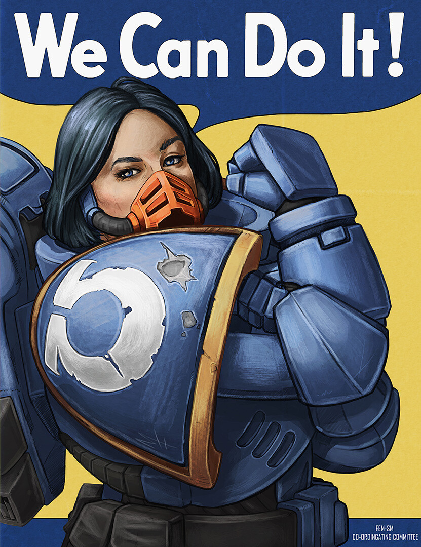
An obvious play on a famous image, with a 40k twist.

source: artstation site || artstation page || tumblr (fallback link)

artist's: artstation site || artstation page || tumblr || artstation rss feed

21
submitted 1 year ago* (last edited 1 year ago) by Zeus@lemm.ee to c/imaginarywarhammer@lemmy.world
 

nice to have something... much more colourful than normal

Adeptus Custodes

Showing some love for our Golden banana boys. Have a great day everyone.

source: artstation site || artstation page || deviantart || instagram || facebook

artist's: artstation site || artstation page || deviantart || instagram || facebook || artstation rss feed

37
[Untitled] by Ralph McQuarrie (64.media.tumblr.com)
submitted 1 year ago* (last edited 1 year ago) by Zeus@lemm.ee to c/imaginarystarships@lemmy.world
 

i love everything ralph mcquarrie has done. for those who don't know, he did most of the star wars concept art, but he's also done his own pieces too. i have seen unreliable sources claim that this is an early bespin or coruscant concept, but take that with a pinch of salt

higher quality image, but cropped (and with the signature removed):

main image source || hq image source || ralph mcquarrie on wikipedia

10
submitted 1 year ago* (last edited 1 year ago) by Zeus@lemm.ee to c/imaginarywarhammer@lemmy.world
 

finally, it's time for something a little less space marine

source: instagram

artist's: artstation site || artstation page || deviantart || instagram

detail view:


okay i really need to branch out from space marines, i am posting nothing but space marines...

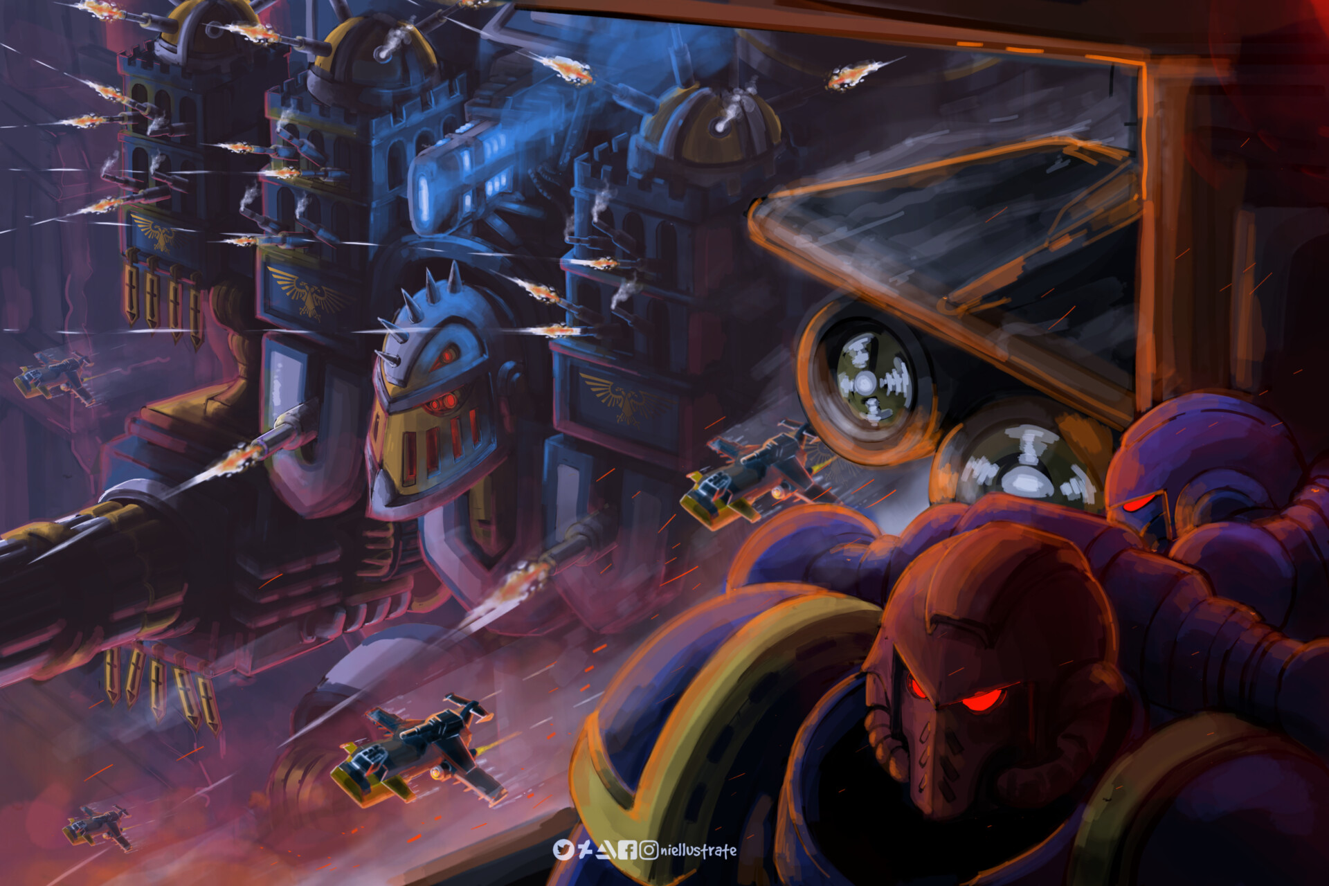
Showing some love for Imperial titan and space marine enthusiast. I really like the appeal of giant robots with churches on top of it. It is just wild. That is why I really like Warhammer.

source: artstation site || artstation page || deviantart || instagram || facebook

artist's: artstation site || artstation page || deviantart || instagram || facebook || artstation rss feed


it's cool to see two ships meeting at an oblique angle! normally in space they just conveniently happen to align with each other

used as an alternative cover of "Ethan of Athos" by Lois McMaster Bujold

source


I decided to try my hand at doing a planet. Turned out okay! Not 100% happy with how all of the surface detail looks but overall I'm pretty satisfied still.


"In ancient times, men built wonders, laid claim to the stars and sought to better themselves for the good of all. But we are much wiser now."


Mars, fourth from Sol. Birthplace of the Adeptus Mechanicus, the secretive priesthood that regulates the distribution and use of technology in Imperial space.

The Red Planet was the first of forge worlds, established by the nascent machine cult to safeguard technology and knowledge through the long millenia of the Age of Strife. Ever since Mars has been the strategic and economical center of the tech-priests' operations, supplying innumerable weapons, vehicles and equipment to the ravenous war machine that is the Imperium of Man.

The planet is ringed by great shipyards that labour endlessly to maintain and reinforce the Imperium's fleets and, in towering hive-factories that rise up as iron mountains through the lethally polluted atmosphere, billions of menials, enginseers and technomancers do their holy work to research, assemble and repurpose ancient tech-lore for use in this new, darker age.

artstation site || artstation page

artist's artstation site || artstation page || deviantart || tumblr || artstation rss feed


used for the cover of vernor vinge's "A Deepness in the Sky"

now to me this looks quite a bit older than 2000; but that's what isfdb says, and who am i to argue?

image source


artstation site || artstation page

artist's artstation site || artstation page || artstation rss feed

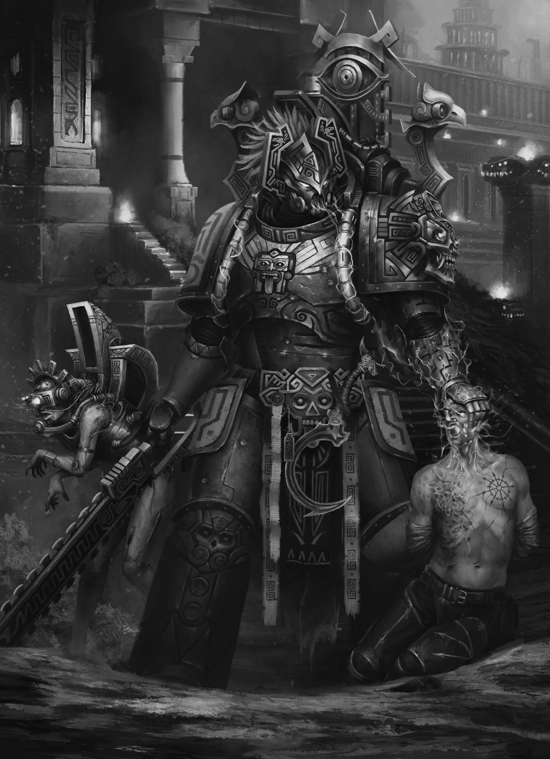
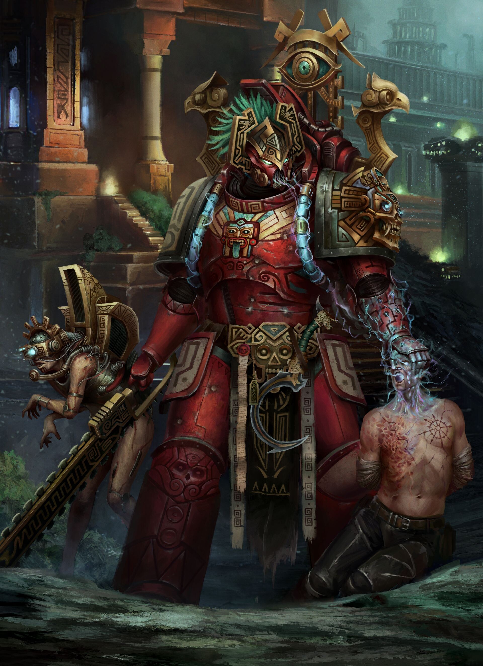
helmet-less version:

greyscale version:

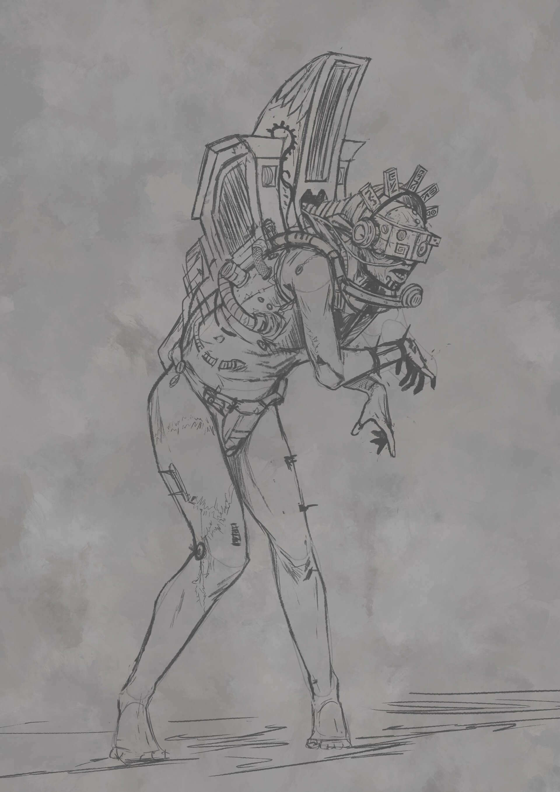
bonus servitor sketch:

view more: next ›