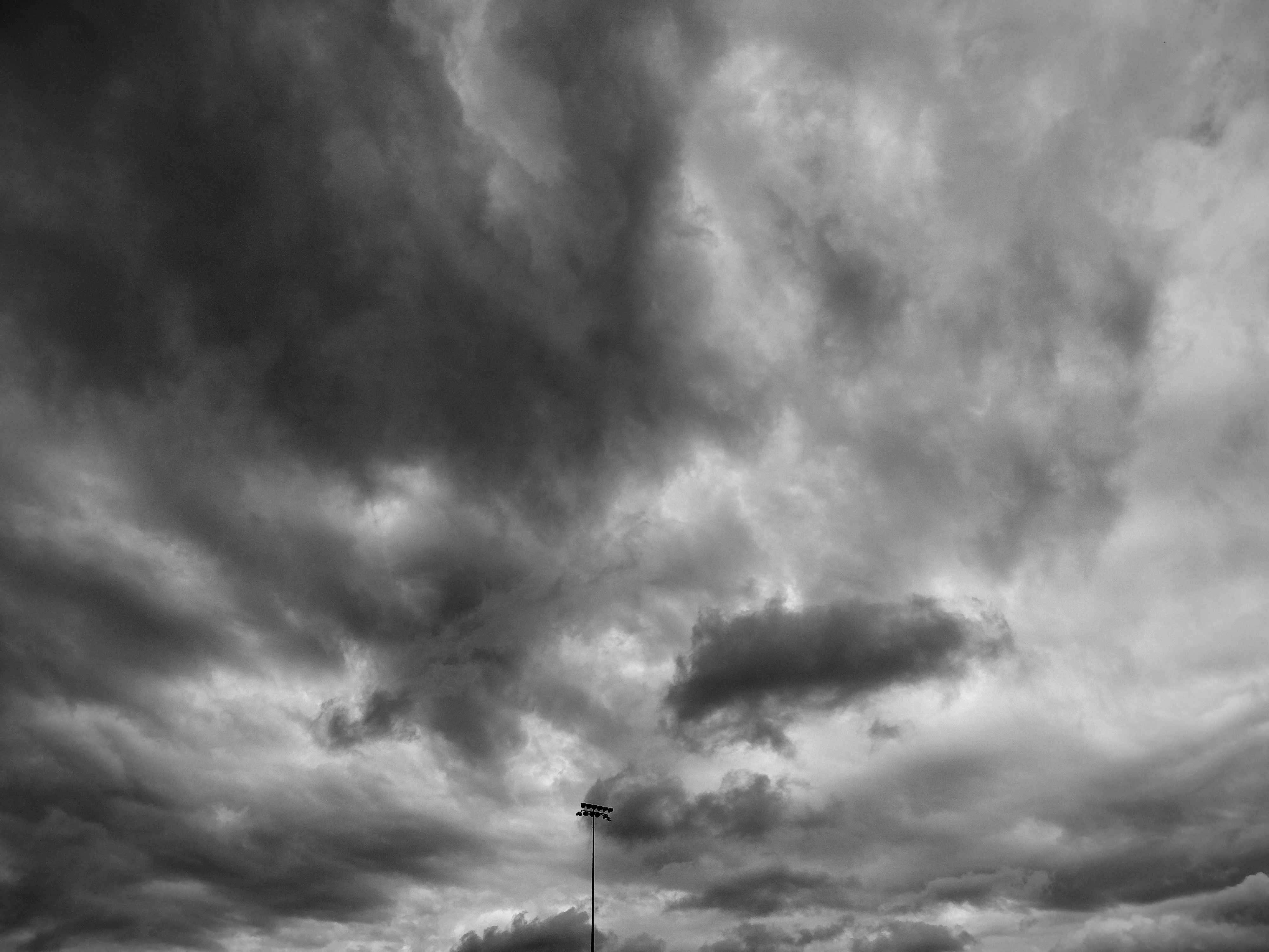
Small critique: I think you overdid it a bit with the contrast.
Don't get me wrong, on a B&W-image that's good, it helps letting the shapes of the wonderful cloud formations pop out.
But maybe decrease the intensity of the darks, that would help in making it a bit less apocalyptic 😁
Also, maybe crop out the last bottom millimeters or retouch them. The trees/ lights look a bit out of place and steal the attention from the main subject.
Other than that, I love it! Keep going! 🙌
