I'm seriously considering making some new ink splatters and then taking a photo. But which ink? 🤔
this post was submitted on 02 Jul 2023
20 points (100.0% liked)
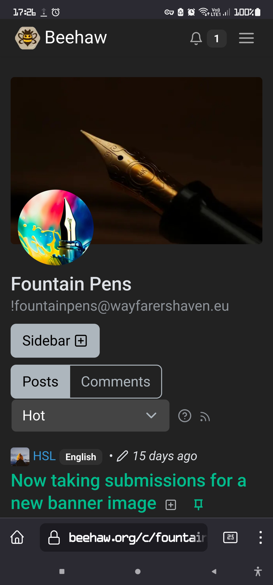
Fountain Pens
13 readers
2 users here now
Inspired by /r/fountainpens, a place to discuss pens, writing, ink, paper, and whatever else makes your pen flourish.
Related
Banner: @Valdair@kbin.social (Nakaya Decapod) | Icon: @UnfortunateTwist@beehaw.org
founded 1 year ago
MODERATORS
Baystate Blue!
Just kidding - don't do that 😅
Something with crazy much sheen could be sweet.
I don't actually have Baystate Blue but I do have others with sheen!
Making ink splatters is actually easy and a lot of fun: https://fountainpenlove.com/how-to/how-to-make-an-ink-splat/
The baystate Blue was just a joke, because I think it would be silly to use the ink thats known for being difficult to clean 😅
Thanks for the Guide - it seems like a lot of fun.
Emerald of Chivor!
This is just going to be a good excuse to play with ink and make a mess :D
I used Microsoft Designer, an AI image generator. Here's one: 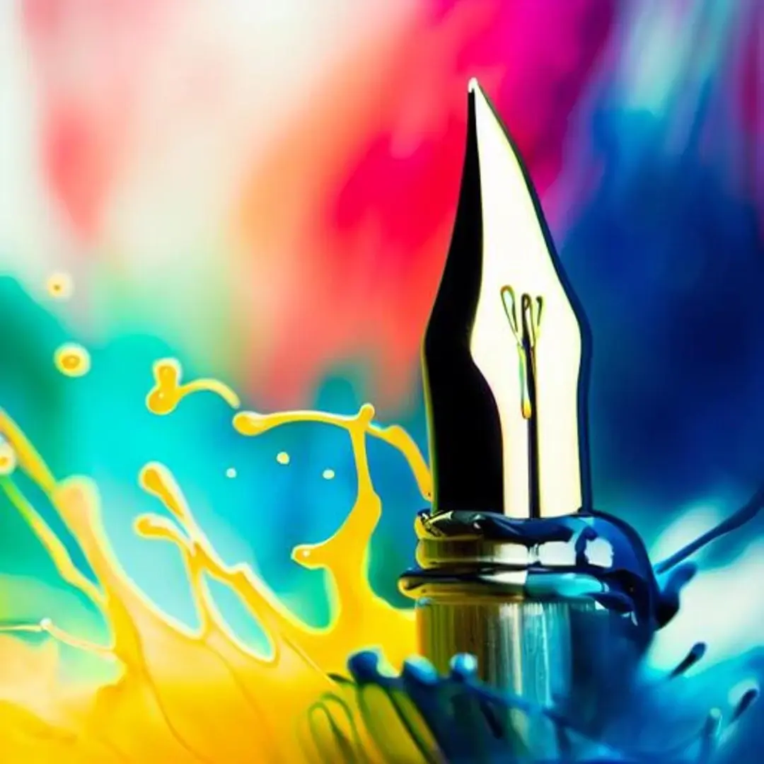
I do wish the nib was straighter. I'm not one for writing great prompts or designing... but using AI is a method you could try.
That's lovely - thank you for sharing!
Are there any guidelines for the dimensions of the banner?
There isn't much official, but I just did some testing and had good results with 970x240. Less than 1MB size and smaller is better.
Here's how I found it:

Although on mobile is way more boxy 🥶
Right, but you need the biggest possible image and then the ui will downscale it as needed.
Here are three I tried putting together, I hope the aspect ratio/size is okay.
EDIT: I have no idea why it's prompting an 18+ warning lmao... I think imgur is a little too gung-ho on their anti pornography filter lately
I missed this comment - sorry about that! That is absolutely gorgeous! <3
Those flourishes 😍
view more: next ›