this post was submitted on 25 Jun 2023
73 points (100.0% liked)

Lemmy Plugins and Userscripts

2145 readers
1 users here now

A general repository for user scripts and plugins used to enhance the Lemmy browsing experience.

Post (or cross-post) your favorite Lemmy enhancements here!

General posting suggestions:

Thanks!

founded 1 year ago
MODERATORS
 

Just an FYI post for folks who are new or recently returning to Lemmy, I have updated the linked grease/tamper/violentmonkey script for Lemmvy v0.18.

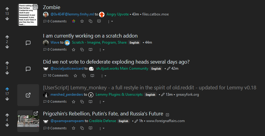
These two scripts (a compact version and a large thumbnail version) substantially rearrange the default Lemmy format.

These are (finally) relatively stable for desktop/widescreen. Future versions will focus a little more on the mobile/handheld experience.

These are theme agnostic and should work with darkly and litely (and variants) themes.

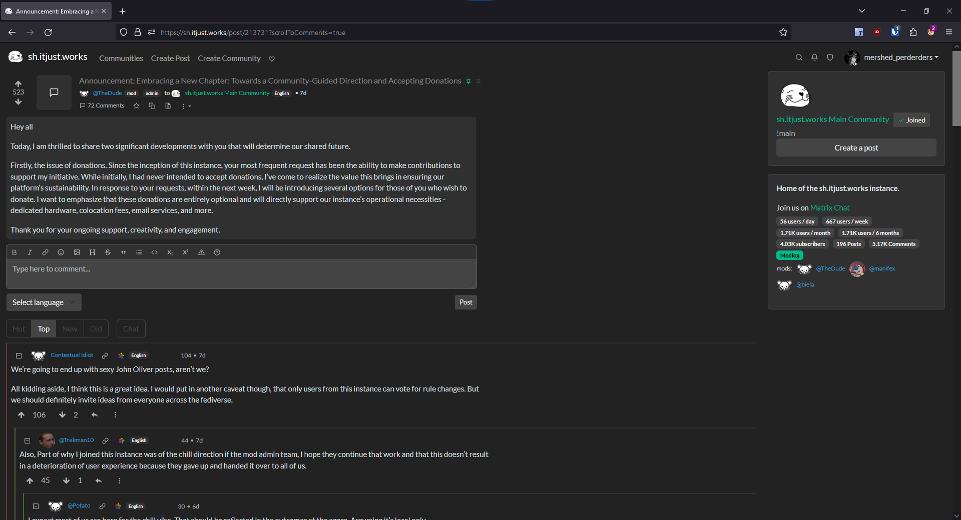
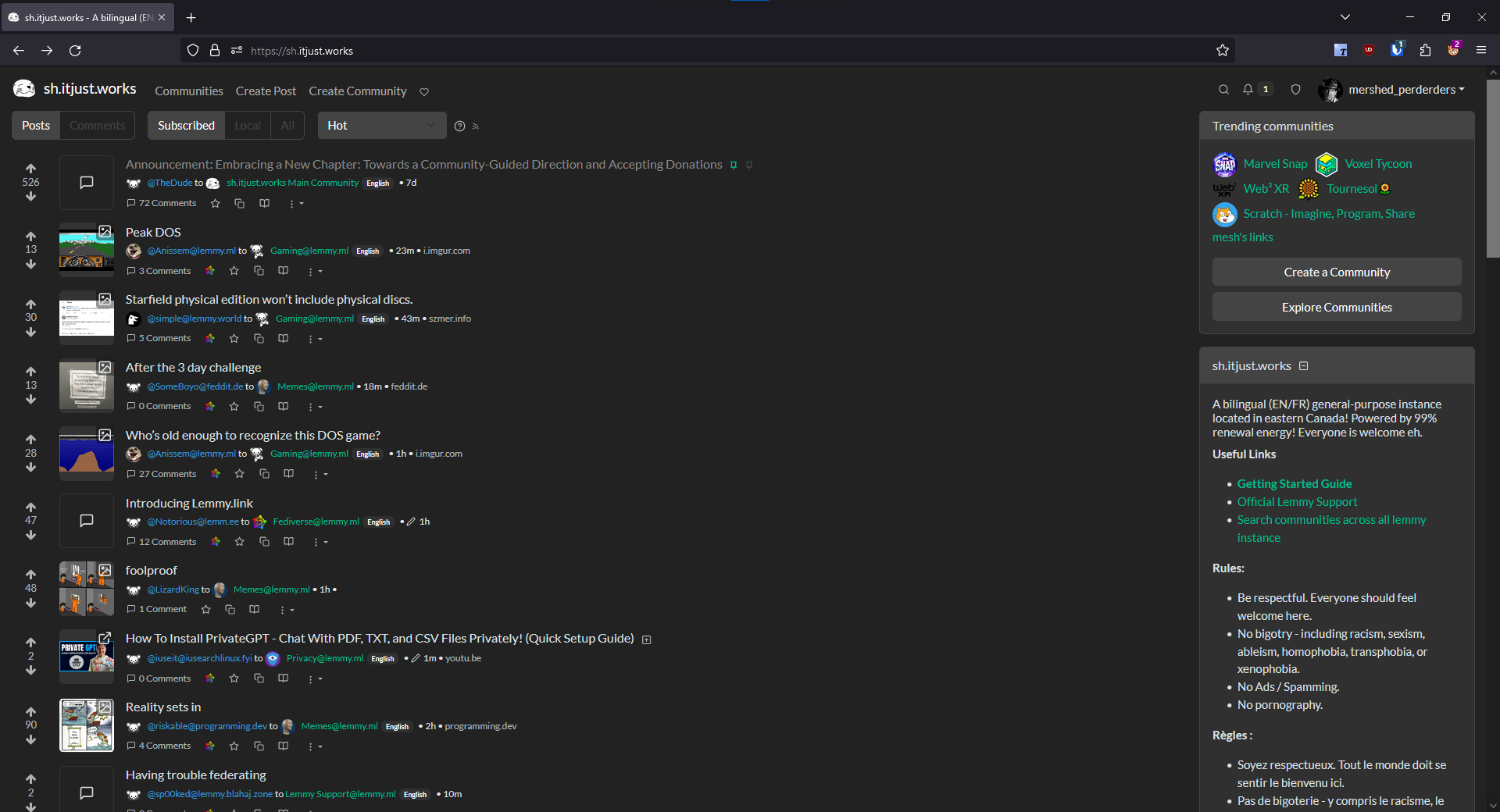
Screenshot of "Compact" version

main page

-

comments page

As always, feedback is appreciated!

top 9 comments
sorted by: hot top controversial new old
[–] Jakylla@sh.itjust.works 7 points 1 year ago (1 children)

So nice ! I was trying to make one to expand the page and use this 40% left-right margin on my screens, Thank you !

Here are my personal adaptations:

- Commented font-size for titles: I didn't like having them as small as the text

CSS code

/* post title font size*/
.h5, h5 {
    /*font-size: 1rem !important;*/
    margin-bottom: 0.1rem !important;
}

.
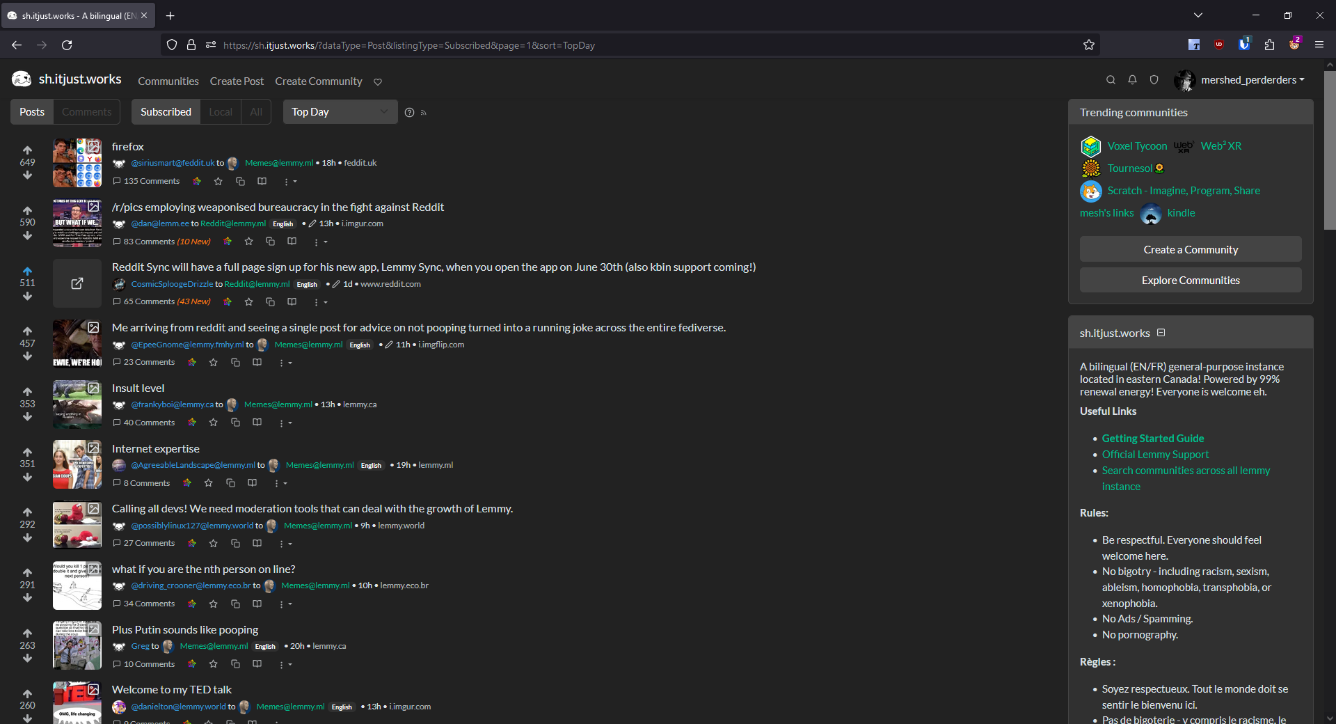
- Added a class for posts without image or links to have a thumbnail without the gray background, to dissociate them from links (that are from my point of view, too similar looking to text only posts)

- Also changed how I display images in thumbnail (I prefer to see the whole image resized down with no crop, even if hardly anything may be readable on the thumbnail)

CSS code

.thumbnail {
    object-fit: scale-down; /* instead of "cover" */
    background-color: #333;
}

/* Remove gray background for only-messages posts thumbnails */
.post-media a[href^="/post/"] .thumbnail {
    background-color: unset !important;
}

ScreenshotScreenshot

(Notice the visible difference between the link and the post without link)
[–] mershed_perderders@sh.itjust.works 3 points 1 year ago* (last edited 1 year ago)

These are nice.

I have thought about making the h5 font-size a user customizable parameter. You are not the only one who prefers the larger font size for titles. It's easy enough to incorporate - I'll experiment and see if there is a way to do it that preserves the variable between script updates.

I also like what you did with the text posts, particularly the scale-down parameter. My preference is preserving the visual outline of the thumbnail area for consistency.

Maybe something like:

CSS code

.post-media a[href^="/post/"] .thumbnail {
  border: 1px solid #333;
  background-color: unset !important;
}

[–] picoblaanket@lemmy.ml 5 points 1 year ago

This cleans up the post info very well - it looks great, thank you :)

[–] Relected@sh.itjust.works 4 points 1 year ago

oh fuck yeah

[–] MonkCanatella@sh.itjust.works 2 points 1 year ago

ngl, I actually am starting to prefer lemmy's UI. Looking at lemmy with this script reminds me how bad reddit's UI is. While Lemmy isn't taking home any prizes for its ui, It honestly beats reddit

[–] howdy@thesimplecorner.org 2 points 1 year ago* (last edited 1 year ago)

old.aliensite was a feeling... this is it! Thank you!!! I'll update you if I fiddle with it or see any problem. Looks good with my little LemmyTools script too!

[–] MinFapper@lemmy.world 2 points 1 year ago (1 children)

Out of curiosity, you reckon it's feasible to add this directly into the Lemmy UI (since it is open source)?

That way, some instance admins can enable it for their instance. Then users can simply create an account on one of those instances to see the fediverse with that styling without having to configure/manage anything themselves.

is it feasible? Sure. The script's CSS can be essentially copied wholesale into a required stylesheet.

Will it ever happen to the "Default" Lemmy UI? Probably not.

There are a few catches with this: 1) it has been explicitly communicated by the Lemmy devs that the stylesheet and styling framework (Bootstrap v4 / v5) will be changed in the future for a different framework, and 2) classes and IDs used by elements are not considered "safe" or "static" for future development. These issues are less of a challenge for traditional theming, which applies different colors to standard web elements; but they are more of a challenge for things like this that make wholesale changes to the layout (and largely leaves colors alone).

That said, there is at least one instance that I am aware of that is trying to make this the default layout: forum.basedcount.com. It appears that incorporation has not been rolled out just yet though.

[–] briongloid@aussie.zone 1 points 1 year ago

This looks great, I would love to go back to the old feel.

load more comments
view more: next ›