Terrible Estate Agent Photos
Terrible photos listed by estate agents/realtors that are so bad they’re funny.
Posting guidelines.
Posts in this community must be of property (inside or out) listed for sale which contains a terrible element. “Terrible” can refer to:
-
the photo itself (finger over the lens, too far away, people in the shot, bad Photoshop, etc.)
-
the property (weird layout, questionable plumbing, unsound structure, etc.)
-
the interior (carpeted bathrooms, awful taste interiors, weird mannequins/taxidermies/art, inflatable pools indoors, etc.)
-
the actual listing itself including unusual descriptions and unrealistic pricing. However, this isn’t a community to discuss the housing market in general. This is a comedic community - let’s keep it light.
-
Photos can be sourced from anywhere and be any age, but please check they haven’t already been posted.
-
Censor any names/contact details of private individuals.
-
Mark the post NSFW if it includes nudity or sensitive content
Rules.
This community follows the rules of the feddit.uk instance and the lemmy.org code of conduct. I’ve summarised them here:
- Be civil, remember the human.
- No insulting or harassing other members. That includes name-calling.
- Respect differences of opinion. Civil discussion/debate is fine, arguing is not. Criticise ideas, not people.
- Keep unrequested/unstructured critique to a minimum.
- Remember we have all chosen to be here voluntarily. Respect the spent time and effort people have spent creating posts in order to share something they find amusing with you.
- Swearing in general is fine, swearing to insult another commenter isn’t.
- No racism, sexism, homophobia, transphobia, xenophobia or any other type of bigotry.
- No incitement of violence or promotion of violent ideologies.
view the rest of the comments

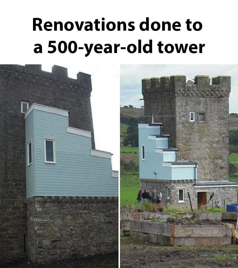
People are such perfectionists when it comes to buildings. I love this image; the patchwork aesthetic needs less hate. Yeah it looks silly, but why should it look serious? I wouldn't be upset if a building built today were to have an awkward attachment added in 500 years that was built to the design standards of that time period.
Somebody showed me recently the rebuild of the Augusteum building of the University of Leipzig which had a hyper-modern redesign like 180 years after it was first built (look it up, it's pretty cool). And the building in this post is like a lower-effort, more earnest version of that idea. Is it bad real estate? Sure. But it's good architecture. "Authenticity" be damned.
Basically, do you want an abandoned ruin rotting away in a field, or do you want a building that people will continue to live in and take care of into the future?
This comment made me partially re-evaluate my opinion of this building