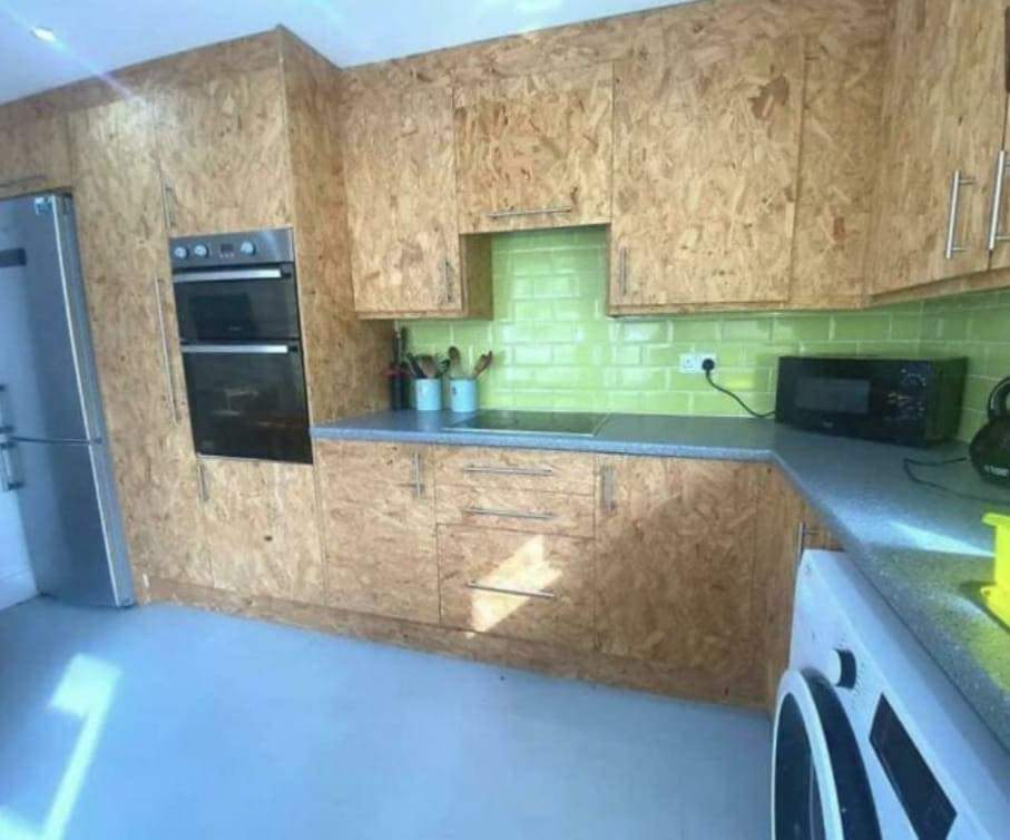
Terrible Estate Agent Photos
Terrible photos listed by estate agents/realtors that are so bad they’re funny.
Posting guidelines.
Posts in this community must be of property (inside or out) listed for sale which contains a terrible element. “Terrible” can refer to:
-
the photo itself (finger over the lens, too far away, people in the shot, bad Photoshop, etc.)
-
the property (weird layout, questionable plumbing, unsound structure, etc.)
-
the interior (carpeted bathrooms, awful taste interiors, weird mannequins/taxidermies/art, inflatable pools indoors, etc.)
-
the actual listing itself including unusual descriptions and unrealistic pricing. However, this isn’t a community to discuss the housing market in general. This is a comedic community - let’s keep it light.
-
Photos can be sourced from anywhere and be any age, but please check they haven’t already been posted.
-
Censor any names/contact details of private individuals.
-
Mark the post NSFW if it includes nudity or sensitive content
Rules.
This community follows the rules of the feddit.uk instance and the lemmy.org code of conduct. I’ve summarised them here:
- Be civil, remember the human.
- No insulting or harassing other members. That includes name-calling.
- Respect differences of opinion. Civil discussion/debate is fine, arguing is not. Criticise ideas, not people.
- Keep unrequested/unstructured critique to a minimum.
- Remember we have all chosen to be here voluntarily. Respect the spent time and effort people have spent creating posts in order to share something they find amusing with you.
- Swearing in general is fine, swearing to insult another commenter isn’t.
- No racism, sexism, homophobia, transphobia, xenophobia or any other type of bigotry.
- No incitement of violence or promotion of violent ideologies.
view the rest of the comments

It's taking a post modern architecture concept and applying it to just what the home owner can reasonably change.
The idea is that the building shouldn't hide or obscure what the materials it is made from. You'll see it in buildings with deliberate exposed pipes, exposed concrete, unfinished wood.
It's about honesty and function.
The problem is to make this work they needed to go further or not so far. A polished concrete countertop, industrial tiles and industrial appliances could make this work better. Or using plywood rather than OBS.
I don't get the OBS choice because cabinets are usually made out of plywood which, like you said, would look way better
OBS looks more 'real'. Cabinets are usually made of MDF or OBS in the UK. MDF has great dimensional stability but it is prone to swelling in humid environments, so it would have a veneer or coat of paint in a kitchen.
Plywood is also much more expensive in the UK relative to OBS. I know OBS is made in the UK, plywood is more likely to be imported.
But do you generally make kitchen cabinets out of OBS there? If not then I feel like the designers wasn't going for post modern, they were aiming for it to look cheap and ugl
Kitchen cabinet are made with veneered OBS. That is purchased cut and veneered to size like flat packs.
It's possible someone with a CNC machine built this kitchen to be as cheap as possible (without including the expense of the CNC). The CNC would allow the tight tolerances and very little tare out you would normally expect with OBS.
I really appreciate this (possible) explanation!