this post was submitted on 19 Feb 2024
44 points (95.8% liked)
Connect for Lemmy App
2675 readers
1 users here now
A community for the mobile app Connect for Lemmy.
Links
founded 1 year ago
MODERATORS
you are viewing a single comment's thread
view the rest of the comments
view the rest of the comments

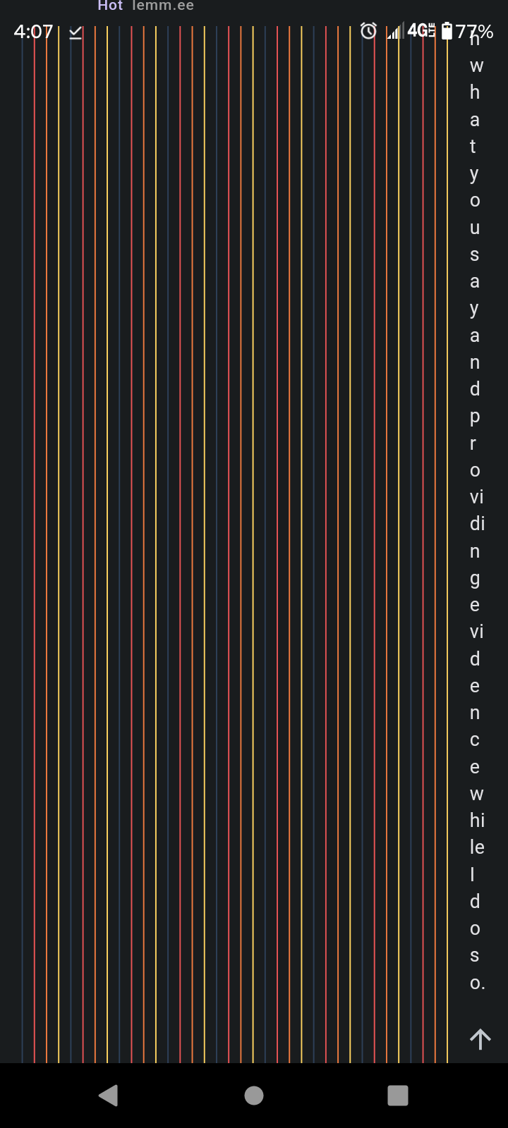
How do the other apps handle this? I think I can add in handling for this easily enough, I just haven't seen it before.
That's pretty much why I brought it up, it doesn't seem to come up often. But if Lemmy grows it will. Better to see the edge cases now before they become common.
I'm going to try a small modification in the beta tonight, please let me know your thoughts. The comment actions will now always span the full width and instead of tons of comment lines it will be a bit cleaner.
How would I grab the beta?
There should be a join link on the store listing page
Alright, so I'm on the beta. Unfortunately switching to it removed that giant comment chain from my accounts replys. So I can't test it.
If anyone has any big comment chains I'm happy to visit it for testing.
https://lemm.ee/comment/9411920
Hopefully you can see the chain from that. Here a picture while using the beta
Thanks for the link! This should now be fixed on ver 173.
Very nice, it works perfectly. Thank you :)