this post was submitted on 05 Feb 2024
722 points (97.6% liked)
Gaming
3089 readers
526 users here now
!gaming is a community for gaming noobs through gaming aficionados. Unlike !games, we don’t take ourselves quite as serious. Shitposts and memes are welcome.
Our Rules:
1. Keep it civil.
Attack the argument, not the person. No racism/sexism/bigotry. Good faith argumentation only.
2. No sexism, racism, homophobia, transphobia or any other flavor of bigotry.
I should not need to explain this one.
3. No bots, spam or self-promotion.
Only approved bots, which follow the guidelines for bots set by the instance, are allowed.
4. Try not to repost anything posted within the past month.
Beyond that, go for it. Not everyone is on every site all the time.
Logo uses joystick by liftarn
founded 1 year ago
MODERATORS
you are viewing a single comment's thread
view the rest of the comments
view the rest of the comments

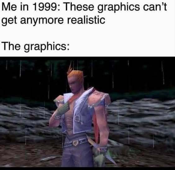
I totally disagree. I liked the design of quake a lot more than duke nukem. I liked the dark, dungeonesque aesthetic, and, even without GL particle physics, thought it was much better looking than it's predecessors. It was designed to look like huge temples to eldritch gods and it nailed that.
Quake2 was a big improvement in PvP, however I think it had a lot of the same blockiness, the gibb was less impressive, and it suffered a lot of the same issues with color, just instead of brown/black/green/red, it was grey/green/yellow/red. Sure the polygons were smaller, and more numerous, time, and tech, had advanced. However it wasn't a huge improvement. I also preferred the sound design of the first, and not just the musical sound track, Quake 1 was much more eerie. It really wasn't until Q3 Arena that the color palate really opened up.
Previous games looked like cardboard cut outs with higher quality pictures glued to them, in a world of plywood covered covered frames also with images glued to them. Quake was like mannequins passing though a brutalist architecture mock-up.
However, 1996 I had and ATI Rage GPU. In 1997 I upgraded to a pent2 mmx with a voodoo that had a secondary 2d card supporting it. So I may have had a different experience.
I don't think Q2 had nearly as many issues with color as a whole through the game. I mean, it wasn't the most colourful game either on any given screenshot, but it had more biomes and locations. At the very least they learned how to make outdoors look like outdoors, with the bright red skies contrasting with the grey interiors. Later on they even throw a bunch of green lights around when they're feeling frisky.
You're not wrong that Id only stopped making brown games in Quake 3, which if anything is a bit too garish sometimes. I also don't disagree about your description of early shooters, all I'm saying is that people had been getting good at using that cardboard cutout tech and people had gotten good at parsing it. Moving to full 3D required a few steps backwards to then push the tech back past that point, and Quake 1 was a big muddy mess of a game. If you were able to read brutalist eldrich temples as opposed to sand-colored legos that's fair, but even with all the flashy new tech it never read like that to me at the time.