Technology
This is the official technology community of Lemmy.ml for all news related to creation and use of technology, and to facilitate civil, meaningful discussion around it.
Ask in DM before posting product reviews or ads. All such posts otherwise are subject to removal.
Rules:
1: All Lemmy rules apply
2: Do not post low effort posts
3: NEVER post naziped*gore stuff
4: Always post article URLs or their archived version URLs as sources, NOT screenshots. Help the blind users.
5: personal rants of Big Tech CEOs like Elon Musk are unwelcome (does not include posts about their companies affecting wide range of people)
6: no advertisement posts unless verified as legitimate and non-exploitative/non-consumerist
7: crypto related posts, unless essential, are disallowed
view the rest of the comments

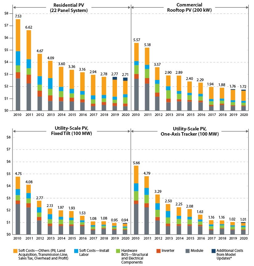
The cost of the panels themselves doesn't seem to have gone down nearly that much.
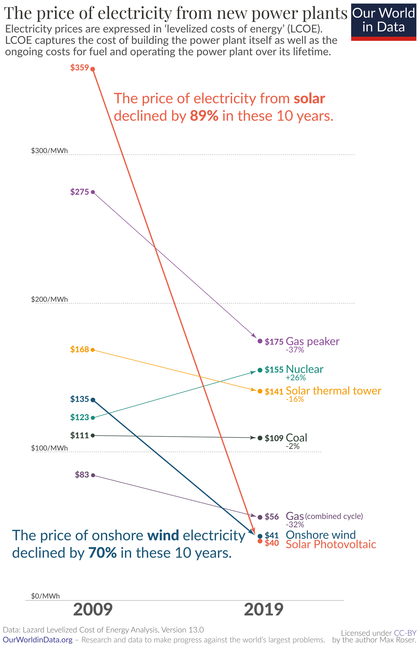
OP's data is LCOE, which takes into account much more than $/MW. Rather importantly, expected operating liftetime is a major component (and historically THE major economic downside of PV).
IIRC, LCOE is calculated for utility-scale solar, which has seen a 500% decrease according to your chart.
Finally, Neither chart specifies, but if OP's is in constant dollars and yours isn't that would explain a lot as well.