this post was submitted on 18 Jun 2023
328 points (98.8% liked)
Lemmy.World Announcements
29042 readers
2 users here now
This Community is intended for posts about the Lemmy.world server by the admins.
Follow us for server news 🐘
Outages 🔥
https://status.lemmy.world
For support with issues at Lemmy.world, go to the Lemmy.world Support community.
Support e-mail
Any support requests are best sent to info@lemmy.world e-mail.
Report contact
- DM https://lemmy.world/u/lwreport
- Email report@lemmy.world (PGP Supported)
Donations 💗
If you would like to make a donation to support the cost of running this platform, please do so at the following donation URLs.
If you can, please use / switch to Ko-Fi, it has the lowest fees for us
Join the team
founded 1 year ago
MODERATORS
you are viewing a single comment's thread
view the rest of the comments
view the rest of the comments


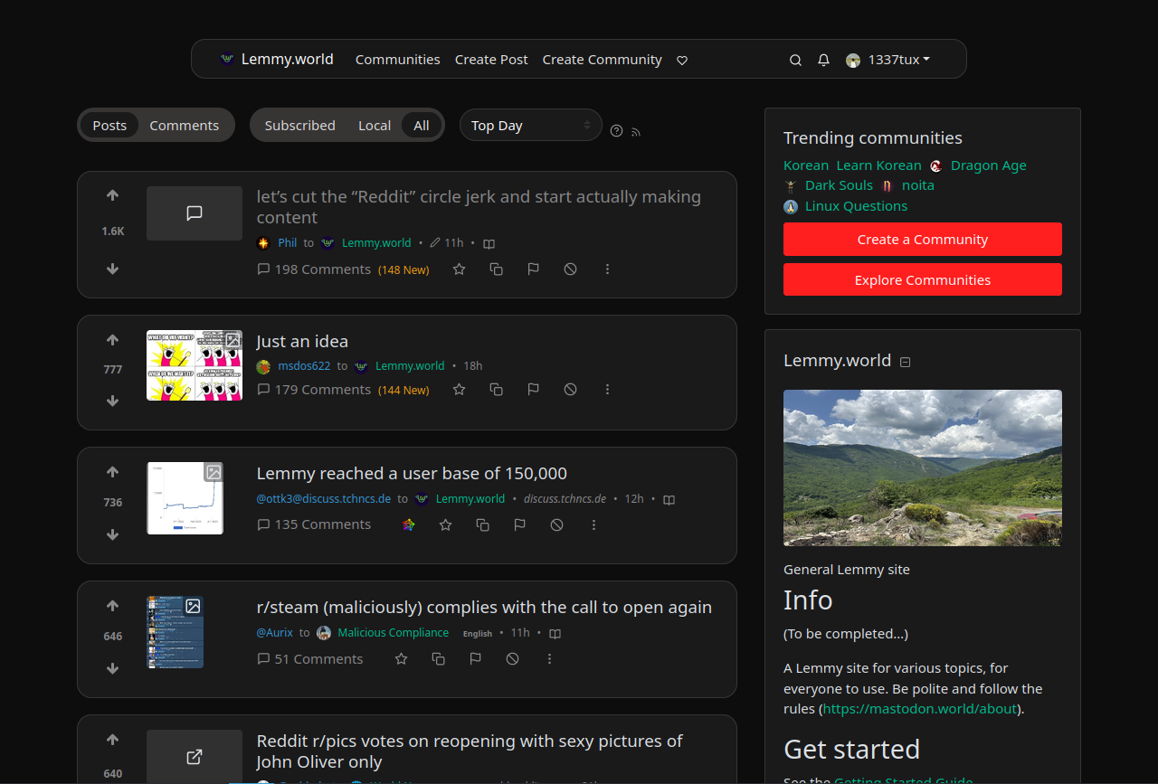
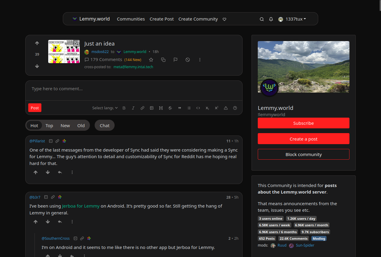
And what is it with the narrow aspects? I totally get the need for mobile support, but the default desktop view looks like it's trying to play nice with old 4:3 aspects. If that's the root design goal, I sure hope we can let that design goal die. In a 16:9 maximized window there is so much wasted real estate it pains me.
Lemmy doesn't run very well on mobile either. It crashes and burns on my iPad (probably because it doesn't fully support whatever fancy JavaScript it relies on), and Kbin is the only way to connect with Lemmy communities, since their site does work.
I think that’s the websocket connection that they are working on removing in the next version. Should make the loading issues on mobile go away.
That's weird. For me it is kbin that crashes all the time. Lemmy works fine. I like kbin's vibe and concept, I just figured it was still really buggy. Now I'm thinking maybe the problem is on my end.
I know - the default layout seems ludicrously cramped on a widescreen monitor. I wonder why the devs ever decided on the default CSS values.
After some tweaking, I'm quite happy with my setup now.