this post was submitted on 30 Oct 2024
546 points (92.8% liked)
Technology
59588 readers
3084 users here now
This is a most excellent place for technology news and articles.
Our Rules
- Follow the lemmy.world rules.
- Only tech related content.
- Be excellent to each another!
- Mod approved content bots can post up to 10 articles per day.
- Threads asking for personal tech support may be deleted.
- Politics threads may be removed.
- No memes allowed as posts, OK to post as comments.
- Only approved bots from the list below, to ask if your bot can be added please contact us.
- Check for duplicates before posting, duplicates may be removed
Approved Bots
founded 1 year ago
MODERATORS
you are viewing a single comment's thread
view the rest of the comments
view the rest of the comments

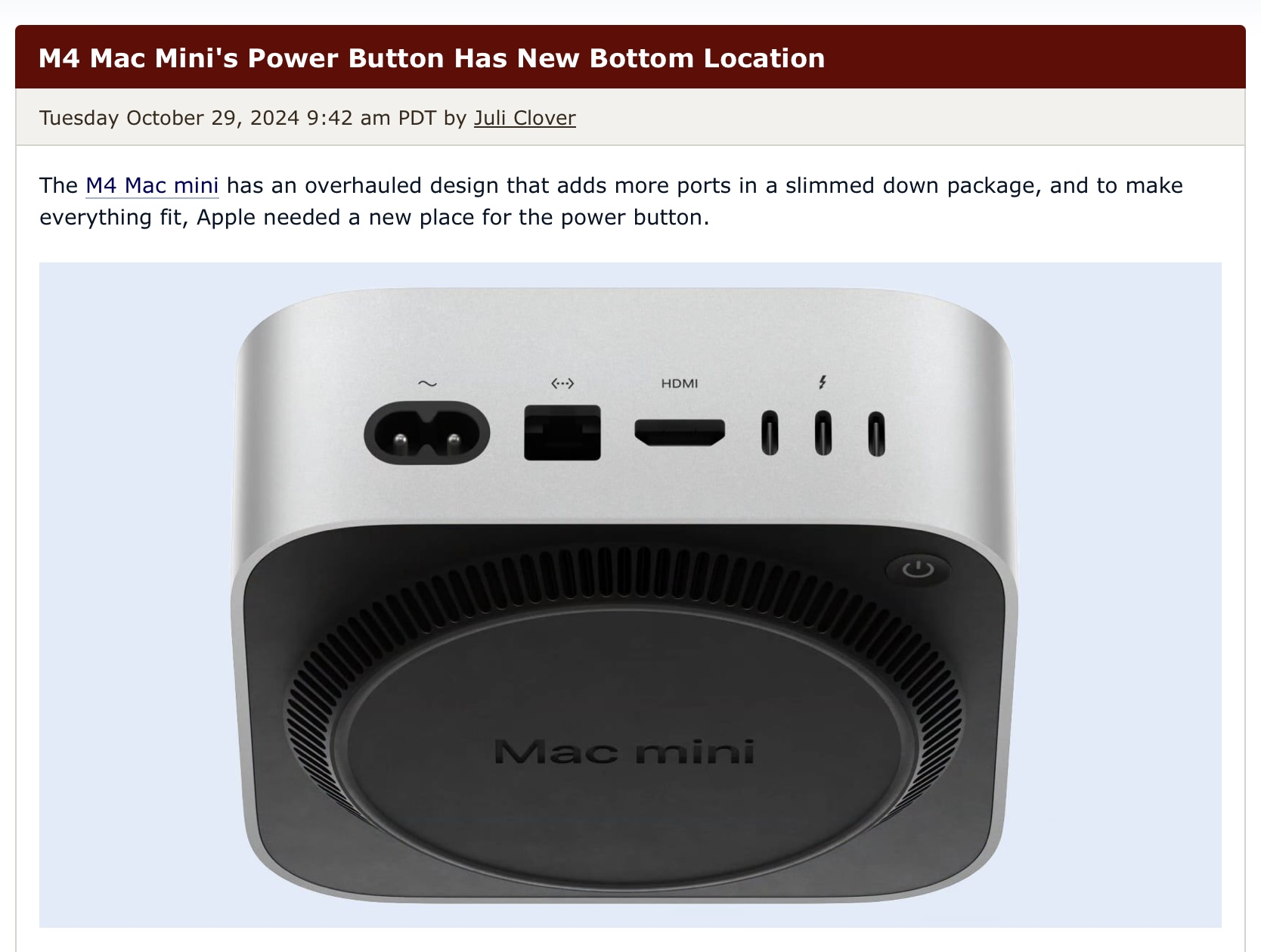
I also at first thought it's not that bad, because it looks like the main part of the computer is "hovering", because it stands on that round portion. But then I saw that the button is on the backside! Why? That way you have to reach around everything, making it impossible to fit the thing into some smaller space and still use it. If it was on the bottom but in the front you would still have your beloved button-less design but the button would still be pretty accessible.