this post was submitted on 07 Jun 2023
4 points (83.3% liked)
Mlem for Lemmy
5497 readers
13 users here now
Official community for Mlem, a free and open-source iOS Lemmy client.
Rules
- Keep it civil.
- This is a forum for discussion about Mlem. We welcome a degree of general chatter, but anything not related to Mlem may be removed at moderator discretion. This is not a forum for iPhone/Android debate. Posts and comments saying nothing but "iOS bad/I use Android" will be removed as off-topic.
- We welcome constructive criticism, but ask that it be both precise and polite.
FAQ
- When will insert feature here be implemented?
- Check our issue board--if there isn't an issue open for the feature you want, feel free to open an issue or make post! Just remember that devs are people too--we're doing this for free in our spare time, and building a quality app takes a lot of patient work.
- Is Mlem available for Android?
- No. Mlem is written using SwiftUI, which is not currently supported on Android. If such support becomes available, we will look into bringing Mlem to our Android friends.
- How do I join the beta?
- We are currently testing our new 2.0 codebase on TestFlight. We have two beta groups: a weekly group that receives the current state of our development branch every week, and a stable group that receives a curated pre-release build at the end of each development cycle.
- Join the weekly beta
- Join the stable beta
- How do I join the dev team?
- Head over to our recruitment channel, or go straight to our GitHub and read CONTRIBUTING.md to get started.
founded 1 year ago
MODERATORS
you are viewing a single comment's thread
view the rest of the comments
view the rest of the comments
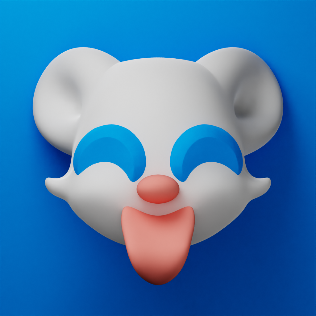
Some feedback intended to be constructive, thanks for contributing to the process!
The gradient on the mouse is a bit too much for me. I would prefer it to look flatter. Compared to the look of most modern app icons, it’s just too 3D for my brain.
I like the tongue sticking out and the eyes, but my suggestion would be to slightly tone them down. Maybe make them smaller in size (eyes in particular)?
My personal preference is that the mouse take up a little more space in the icon, but that’s just nitpicking.
FYI it’s a Lemming
Ah, a that makes sense. That being said though, I would personally recommend drastically scaling down the ears for a more lemming like look.