this post was submitted on 30 Aug 2024
1532 points (96.9% liked)
Memes
45730 readers
556 users here now
Rules:
- Be civil and nice.
- Try not to excessively repost, as a rule of thumb, wait at least 2 months to do it if you have to.
founded 5 years ago
MODERATORS
you are viewing a single comment's thread
view the rest of the comments
view the rest of the comments

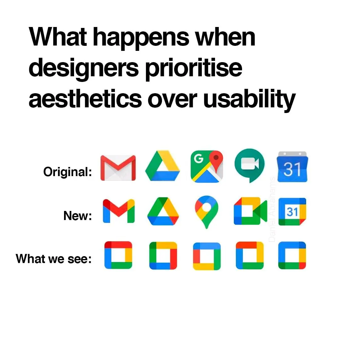
i think they did need to unify the design and branding but i also agree they went too far with it. if they had only chosen 1-2 colors for each app icon that would have helped a lot.
gmail - red
drive - yellow
maps - green
meet - blue
calendar - lighter blue
problem solved
Problem solved! If we ignore the world's ~300 million colorblind people.
The icons would still have different shapes, right?
Yes, but the original post is suggesting that they're ambiguous enough to all be squares. Running with that concept, making a bunch of squares different colors doesn't fix the issue for those of us who can't easily identify those colors.