this post was submitted on 06 Aug 2024
123 points (95.6% liked)
AssholeDesign
7544 readers
3 users here now
This is a community for designs specifically crafted to make the experience worse for the user. This can be due to greed, apathy, laziness or just downright scumbaggery.
founded 1 year ago
MODERATORS
you are viewing a single comment's thread
view the rest of the comments
view the rest of the comments


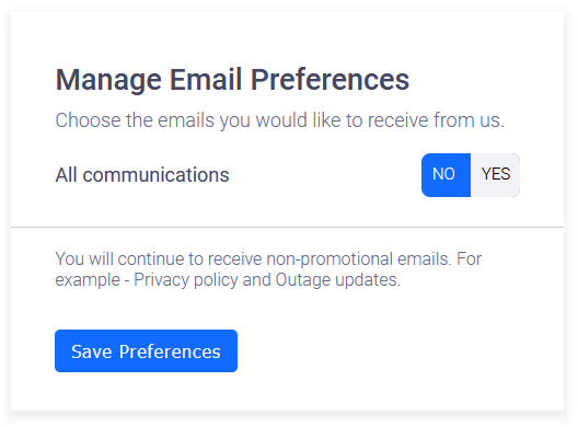
For those saying this is probably just the devs being lazy... Well, they took the effort to write these two lines of CSS, and took the time to make sure they displayed as the exact same color.
So there was effort to make both sides blue, whether that was incompetence or intentional, the design itself is still an asshole design and should be shamed :) Good toggle switches can be found all over the web in seconds!