this post was submitted on 18 Jul 2024
42 points (90.4% liked)
Firefox
17952 readers
188 users here now
A place to discuss the news and latest developments on the open-source browser Firefox
founded 4 years ago
MODERATORS
you are viewing a single comment's thread
view the rest of the comments
view the rest of the comments

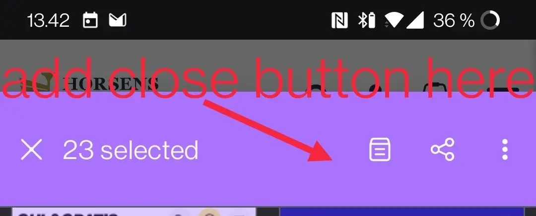
Close doesn't need to be there since its on the left and bookmark should take precedent over collections, since those are literally just bookmarks too.
Where on the left? The X icon? Have you tried to press the X icon?
Bookmarks and collection are the spawn of the devil. Collections is not a desktop feature thus rendering sync useless. Just use bookmarks.
Sorry, the X was cancel selection not close the selected tabs.