nice, thanks. arctic is definitely by far the best ios client
Arctic
Arctic is a Lemmy client for iOS built on pure Swift. It currently supports iOS 15+ and Lemmy v0.17+
Get the latest version on TestFlight, or check it out on the AppStore.
If you would like to support Arctic’s development, feel free to Buy Me A Coffee
Thank you so much, I’m glad you’re enjoying it!
Woahhhh, what an insane update. I can honestly use: 🤯
Thanks a ton for the hard work you’ve put in, and now I get to look around at all the small adjustments lol.
I’m super excited about this release. It’s been a crazy amount of work over that last month, but I think it’s definitely paid off.
I hope you enjoy the update, please let me know if you have any feedback.
Reading the changelog took so much time that I don't even want to know how long it took to develop all of this.
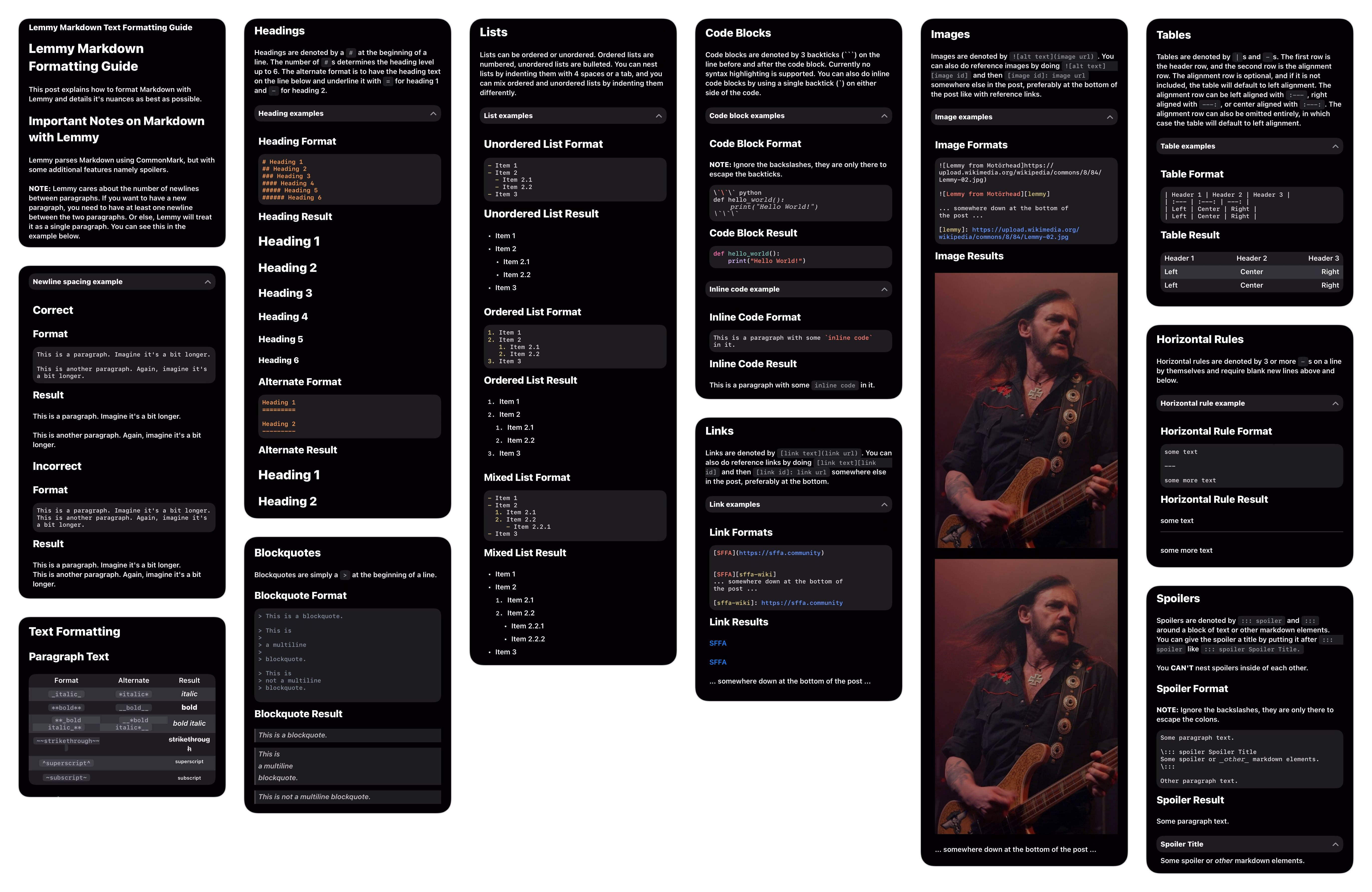
Bro did you really just say “9.3/10 rating for md handling? Meh, I can do better.”? You’re a legend.
Haha, yeah. What it really came down to was scrolling through the comments in that post. I noticed a lot of issues with Markdown rendering for some edge cases. For a Markdown based platform, at the very least the clients should properly support Markdown rendering.
That’s one hell of a change log lol, thanks!
My pleasure, Hope you enjoy it!
Thank you so much!!
Always a pleasure, hope you enjoy!
Really loving the work you put into this app.
On the profile header, could we get an option to have the more expanded appearance? I like seeing the banner art when people add that to their profile, but the new gradient overlay and position of the avatar and username obscure a lot of it now.
I tried to leave a tip, but the testflight version indicates the transaction would not be real. Is there a way to do that and still use testflight?
Thank you! I’m glad you’re enjoying it.
I had the same thought about the profile header. It looks better than before, but it does obstruct the image. I have a few ideas I want to try in order to continue using the same effect without obstructing the banner image. I’ll definitely figure something out for this, even if it means removing the effect and lowering the avatar section.
Unfortunately, Apple does not allow real purchases inside TestFlight apps. You are however able to switch between the AppStore version and TestFlight version without loosing any settings. Alternatively, I also have a link to Buy Me A Coffee in the Arctic community sidebar.
Being able to edit them myself is all I needed to know. Outstanding!
🎉
Beautiful!
edit: I think the only thing Voyager has that Arctic doesn’t is the “select post/comment text” feature. Unless I just missed it.
Thank you!
Arctic does support selecting text in posts and comments. You can access this feature using (•••) -> Select Text. I’m not sure how Voyager handles text selection, but in Arctic this will show a popup with the raw Markdown for copying.
Perfect. That is similar to Voyager. I have a new daily driver now!
And I decided to leave a tip. Cool confetti!

That’s great to hear! I really glad you’re enjoying it so far.
Than& you for the tip, I had honestly forgotten all about the confetti!
Yeah, it’s a great app. I’m glad it’s around since Apollo is no more (and reddit is dead to me).
I’d suggest you have a tip history on the tip page, so we can see if we’ve tipped and how much so far.
Thank you! I was an avid user of Apollo since day one, Arctic was my way of coping with the loss.
This is a great idea, I hadn’t thought about that before. I’ll look into adding this in the next update.
Wow, thank you for all of the hard work. The themes had me so excited (especially Cremé) but then I saw a… theme maker option?? I literally spent an hour fiddling with a theme and found a combination that I like.
Here are the theme files, if anyone wants to try them. Also it’s the first time sharing files via Proton Drive, so let me know if it works:
https://i.postimg.cc/ncSpFqWK/Lemmy-Artctic-Bookworm-Day.png
https://drive.proton.me/urls/TH0K1XWCY0#2UbAuFxjvF2g
https://i.postimg.cc/BnN0ZxPq/IMG-9458.png
https://drive.proton.me/urls/P57DPY0MMC#aOxfn0nAFLMG
Eventually it would be great to have the labels possibly be easier to figure out what it is changing.
My pleasure! Theme support is something I have wanted to add for a very long time, but I never had the time to work on it, as I knew it would be a lot of work. I’m glad you like it. I could be mistaken, but I believe you may be the first person I had spoken to about theme support nearly a year ago, well its finally here now.
I am planning to make some improvements to the theme editor. I want to add descriptions for each color to specify what it changes. I also need to go through and prevent setting transparency for some colors, and I need to add more preview views so you can see how the theme will look in different contexts.
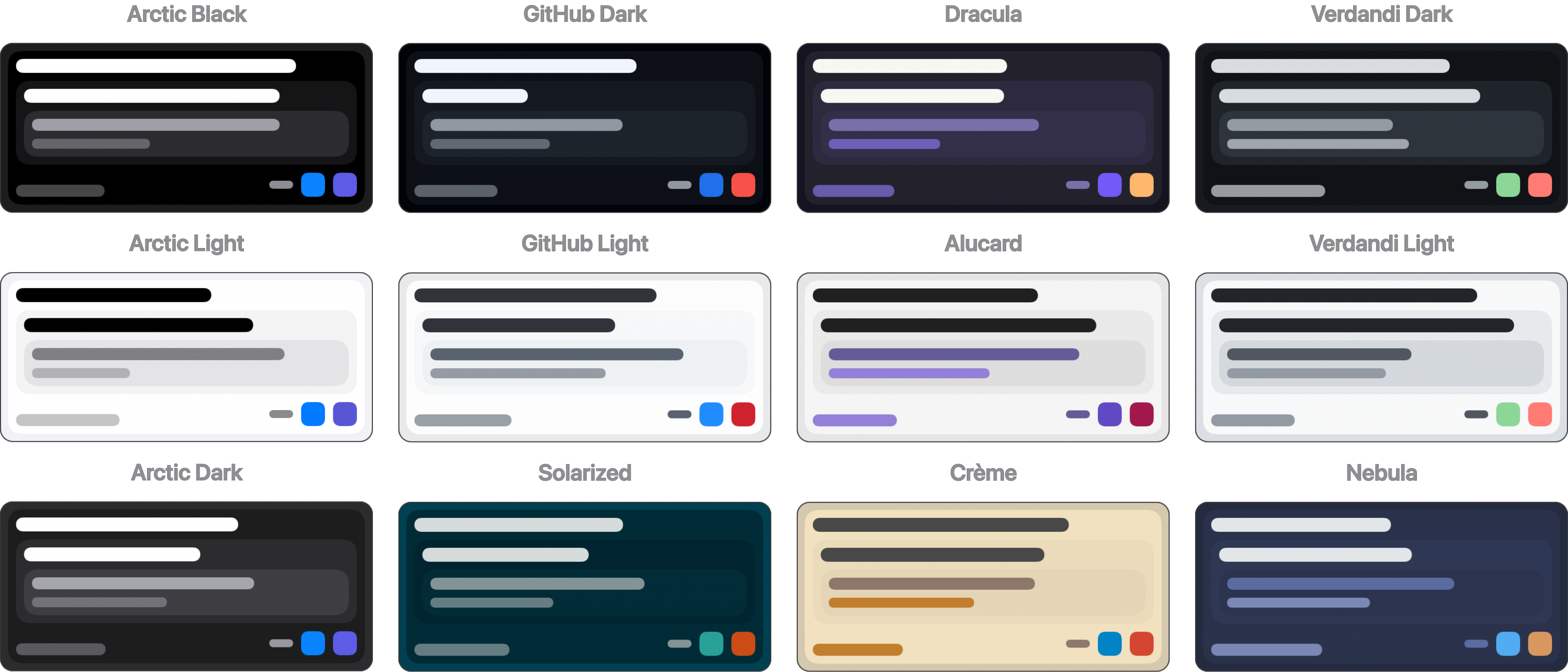
While I was making the default themes, I used vscodethemes.com as a reference for most of them. I just used a color picker and dragged the hex color into Arctic (you can drag and drop any of the colors, including dragging colors from other apps). For testing, you can set the theme you are editing as the active theme, and then whenever you press Save, the theme will be applied throughout the app. This way you can make changes, and then quickly test them in different views.
The themes look great, and the links work well. I didn’t test this until now, but I was able to download and install the themes without leaving the app. So that is great. By the way, if you long press a theme in the theme browser, it allows you to share the generated preview image like the ones I included in the post. I thought this may be useful for anyone sharing a theme to be able to include a preview.
That might have been me, I always ask for more visual options haha. The colors really make it more pleasant to use. Anecdotally, the performance seems better with transparencies off, using opaque colors. 
Thanks for the tip for testing the colors. And sharing the preview. I’ll try editing my post to have the previews included.
Also on a personal note, make sure you pace yourself and take breaks. There will always be more to improve and sometimes I think people feel that they need to push themselves. It can wait. Two of my favorite Lemmy apps kind of just stopped flat, and my hunch is that the developers got burnt out.
Took a look and looks great!
How do I view (and block) instances?
In Voyager I can long press on them from the post. I don’t see the instances in the Arctic posts and my instance blocks aren’t showing up in filters/account blocks for my account.
Click the three dots on the post in question, choose Community, and there you can block the community or the entire instance.
I’m glad you like it!
Thank you for bringing this up, It’s something I keep forgetting to address. Instance blocking in Arctic was added before Lemmy added support for instance blocking. Currently, Arctic does instance blocking locally, rather than using the API. I’ll add support for this in the next update.
Fucking legend.
Is there an other option to buy you a coffee beside the in app purchases? Because I am using the TestFlight version, in app purchases are turned off.
Unfortunately, Apple does not offer a way to enable in app purchases in TestFlight. You are able to switch between the AppStore version and TestFlight version without losing any settings. Alternatively, I do have a Buy Me A Coffee set up if you’d rather use that. I have a link for this in the community sidebar, but I am unable to include alternative payments inside the app itself.
Was just going to submit a scrolling issue, but the GitHub link above isn’t working for me—the other links work fine but not that one :(.
Thanks for letting me know, it’s fixed now. There was a formatting issue with that link. By the way, you can also access the GitHub link from the bottom of the settings page.
I want to ask in rhe nicest way possible if we can have it on the App Store already 🙂
This is coming. I took week off after this last update just because I needed it. I’ve been working on a small updated, mostly just patching some minor issues in the last release. I planned to release this to TestFlight last weekend, and the AppStore this week, however I’ve been fighting a cold all week and it set me back.
I should hopefully release the update this weekend, and I may just submit it to the AppStore as well since there are no braking changes in this release.
I know the AppStore version is way behind, I need to start updating that after each TestFlight release.
Hey, thanks for responding. Get well soon.
Holy smokes! This has been an excellent update. Image & GIF handling is much improved, and overall speed of the app is smoother “feeling” as well. I wanted to get into using themes, but the text colors for the darker themes are too similar to the background they’re on making legibility more difficult. Not a negative for some folks, but not ideal for me.
Thank you! I’m glad you’re liking the update.
As for theme contrast and legibility, the default Dark and Black themes should have plenty of contrast, as they are the default dark mode colors for iOS. The rest of the themes are based off of existing code editor themes, which I may need to tweak a little. In the mean time, you can long-press any default theme and duplicate it, from there you can edit any color you want to change, or you can design your own theme from scratch if you’d like.
This is the first beta release of theming support, there is still a lot that I plan to add and update. I’ll need to spend some more time refining the default themes, as most of them were quickly made while testing the theme editor.

