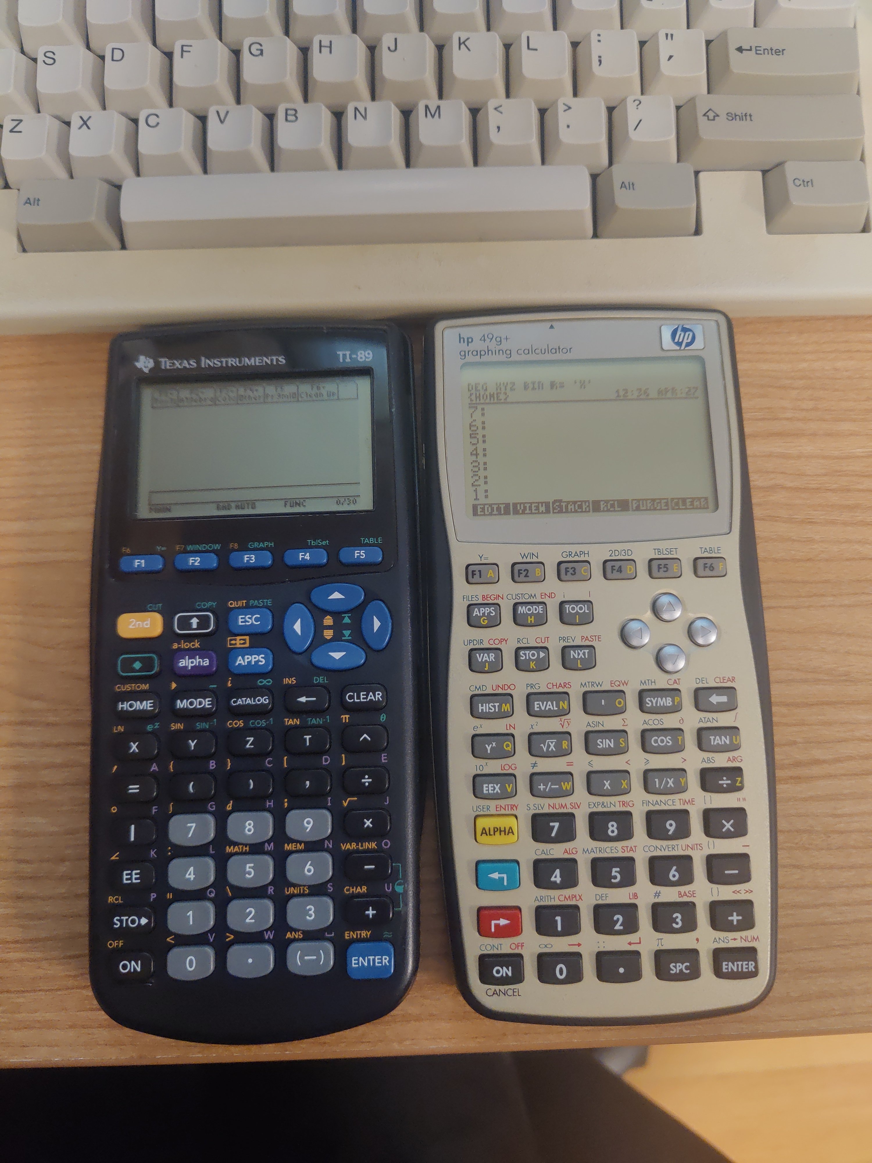
Which UI do you prefer? I have the TI-89 Titanium and it is glaringly obvious that the OS was written for a device like the TI-92 with a full QWERTY keyboard. Does the 49g+ feel more purposefully designed?
Calculator Community
A community centered around handheld calculators. Show off your collections, ask questions, or trade benchmarks and torture tests.
Icon snagged from here.
I've had a TI-89 for a very long time and thought the TI-92 would be nice with the bigger keyboard but I found I actually liked the TI-89 better. I got relatively fast at input, even without the full qwerty layout, and managed to create quite a few programs using the 89 keyboard to type it all. The screen on the 89 has much better contrast too.
I've never had trouble with the TI-89 UI. I definitely like it way better than the TI-84 and similar ones. It's kind hard to compare the ease of use to the HP though because I've had the TI for almost 10 years and have only been using HP calculators for like 1.5 years, most of which was with NewRPL on a 39gs which was quite different from the HP UI on their actual RPN calculators.
And an IBM Model M in the background‽
It's actually a Leading Edge DC-2214. It has Alps SKCM white switches and found it in a basement a few years ago and I love it.
