this post was submitted on 19 Aug 2023
-9 points (42.9% liked)
Firefox
17890 readers
17 users here now
A place to discuss the news and latest developments on the open-source browser Firefox
founded 4 years ago
MODERATORS
you are viewing a single comment's thread
view the rest of the comments
view the rest of the comments

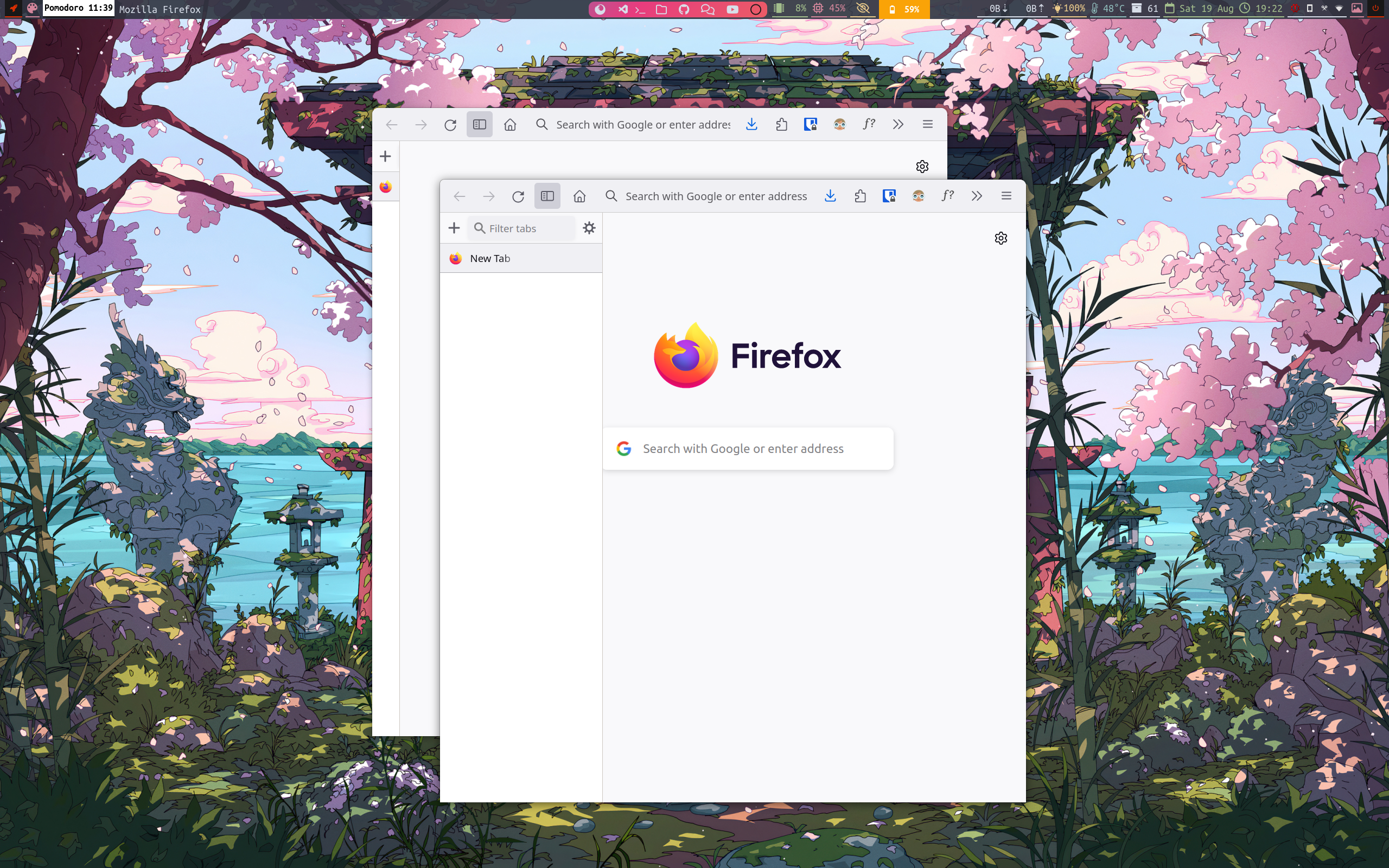
I'm not sure why Firefox must look like a GNOME app by default. IMHO, looks really bad.
Also, how am I supposed to move this window?
@Lucia Its not to make it look like something else, the screens are become wider and not taller, and it make more sense to move the the tab bar to side (vertical tab bar).
I hide the CLOSE, MINIMIZE & MAXIMIZE button as i am using Sway (a tiling window manager).
And to move, we can just press the mod button (CMD on macs and window logo button on keyboards) then just press the left mouse click on firefox to move screen.
Yeah sorry, it looked a bit GNOMEish so I assumed it was related to this desktop.
It makes sense for keyboard-driven window managers as well as for DEs with window decorations, but on GNOME for example this design would leave no place to move a window around.
I use this a lot on Xfce, but most users don't even know they can do this (and will never bother to change their habits). I prefer when application integrates into environment, not forces some kind of workflow. It's totally fine for a personal redesign, but as a main UI it's a bit too much.
I agree, would love to see more customizability on Firefox. I personally prefer tabs to be under toolbar/addressbar, not above it (and to hide when there's only one tab.
@Lucia i was on gnome for a year before switching to sway, so I guess that's the reason of it being looking up like gnome.
As u want tabs to under address bar, it can be achieved, if you are interested I can try to implement it.
Makes sense.
While I don't propose Vivaldi, I must admit the way they're implementing UI/UX for tabs is the right one. They have optional tab bar and grouped vertical tabs in a sidebar (which is also optional). I think Mozilla should learn some tricks from Vivaldi in that respective.