this post was submitted on 25 Jul 2023
5 points (100.0% liked)

Bean

986 readers
1 users here now

Bean is a Lemmy client for iOS.

Download

Bean is available on the App Store here.

Bug Reports

Please report all bugs with the [Bug] flair in your title.

Feature Requests

I'm currently open to feature requests. Please use the [Feature Request] flair in the title of your post so I can keep track of them.

founded 1 year ago
MODERATORS
 

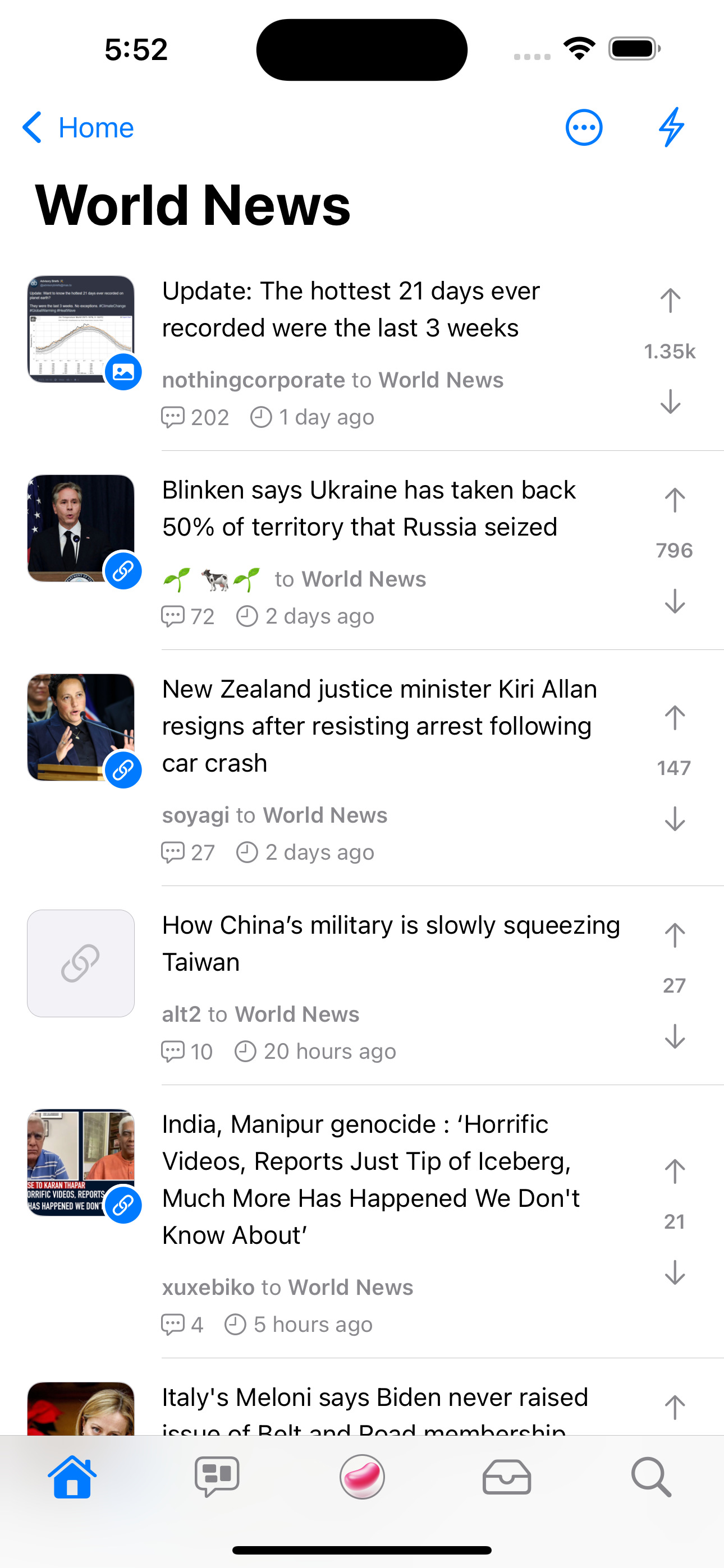
The way this app used to look was quite reminiscent of actual iOS apps.

top 12 comments
sorted by: hot top controversial new old
[–] steve228uk@lemmy.world 3 points 1 year ago (2 children)

I removed them for consistency because they would only be on the Communities and Search screens. It felt weird having some of the tabs with it, and some not.

It’s still there in Settings and I agree that I do really like the large style.

What does everyone else think?

[–] Dark_Blade@lemmy.world 2 points 1 year ago (1 children)

I guess that’s fair, but I assume it’s also a matter of finding ways to implement it elsewhere (easier said than done, obviously).

Also, while I have you attention: Hiding the bottom row on comments also hides the score view. Not sure if that’s a permanent thing, but I just wanted to point it out.

[–] steve228uk@lemmy.world 2 points 1 year ago (1 children)

Yeah, it’s not possible with the context menu selector for All/Local/Subscribed etc and when you use the large style with a search box, it automatically shrinks the nav bar anyway 🙈

Someone else pointed that one out so I’m gonna move the score into the header of the comments when that option is turned on.

[–] Dark_Blade@lemmy.world 1 points 1 year ago (1 children)

Guess it can’t be helped…but if a shame, since the large header really made it look like a native app. Good to know that you’re figuring out the comment footer thing though!

One more thing I was curious about: did you change the weight of the comment theme? The lines look way thicker now than they did earlier.

[–] steve228uk@lemmy.world 2 points 1 year ago (1 children)

I did, I bumped them from 1pt to 2pt. I might add an option in there.

I’ll have a look and see if I can get an option for the large titles if enough people really like them. I’m gonna focus on the final big feature which is creating posts in the meantime.

[–] Dark_Blade@lemmy.world 1 points 1 year ago

I’d appreciate the option, thanks!

[–] berkat@lemmy.world 1 points 1 year ago

I like the large headers as well. There’s probably a way to integrate them across all the tabs in the app. If it’s helpful, I could mock up some ideas. Also, great job with the app so far!

[–] steve228uk@lemmy.world 2 points 1 year ago (1 children)

Okay, I changed my mind. This is coming in the next build, along with a setting to turn them off.

[–] Dark_Blade@lemmy.world 2 points 1 year ago (1 children)

…that looks absolutely fantastic. More native than Apollo, even.

[–] steve228uk@lemmy.world 3 points 1 year ago (2 children)

It’s live now in the build I just pushed out to TestFlight 😊 let me know if you encounter any issues!

[–] Dark_Blade@lemmy.world 3 points 1 year ago

Thanks, it looks absolutely fantastic!

[–] acetuk 1 points 1 year ago

Any chance I can get on the TestFlight?