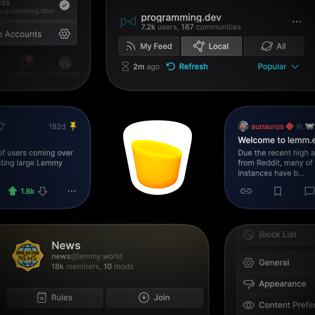
Icon looks like a glass of pee. Could use a lemon or a straw to made it look more…lemony.
Lemmy Apps
A home for discussion of Lemmy apps and tools for all platforms.
RULES:
- No spamming
- Be nice and have fun
- Follow the general lemmy.world rules
An extensive list of Lemmy apps is available here:
Visit our partner Communities!
Lemmy Plugins and Userscripts is a great place to enhance the Lemmy browsing experience. !plugins@sh.itjust.works
Lemmy Integrations is a community about all integrations with the lemmy API. Bots, Scripts, New Apps, etc. !lemmy_integrations@lemmy.dbzer0.com
Lemmy Bots and Tools is a place to discuss and show off bots, tools, front ends, etc. you’re making that relate to lemmy. !lemmy_dev@programming.dev
Lemmy App Development is a place for Lemmy builders to chat about building apps, clients, tools and bots for the Lemmy platform. !lemmydev@lemm.ee
Thanks for pointing that out, I’ll def be working on that 😂
Pee in a glass
Don’t tell me what to do
Looks awesome (I’m writing this comment via Lemmynade.)
Hey, it works! 🎉
Congrats on the alpha 🎉
Thanks, much appreciated!
Have been waiting for this release for a while after seeing your updates - congrats! I’ll have to give the client a shot :) keep up the good work and above all, take yourself before all else… I’ve seen so many app devs burn out after taking things too fast/seriously. Cheers!
The day has finally come!! Huge congratulations, looking forward to testing it!
Thanks a ton! 🎉
Congratulations! What would you say most sets this app apart from was all the others.
Thanks! At this point in time, it’s definitely the design and user-interface. I’m fine-tuning Lemmynade to look clean and feel smooth on every size of device, with touch-friendly gestures and micro-animations. It’s filled with sweeping community banners and colorful indicators to make it feel more alive.
The long-term goal is to be an all-in one website for powerful searching, dead-simple Lemmy onboarding, community discovery, realtime updates, shareable links, and great mod tools. But we need to kill off the bugs and polish things up first before we get there 🙂
Congratulations!
Thanks!
Trying to visit your website gets me an SSL error
Works fine for me. You don't happen to be on a corporate network do you? They sometimes use things that can trigger those warnings.
Hmm, it’s working on my end and the SSL certificate is valid. Can you try the backup domain and see if it works for you?
That one works, thanks!
Looks very cool! I’m very comfortable on Voyager, but I checked it out and my initial impressions:
- Comments take up a LOT of space
- IMO, comment replies should be shown by default (but obviously should also be in a setting)
- The Lemmy devs would prefer if you didn’t show account points.
- IDK if I’d show the name/community of the user above the title
- Showing the title instead of community at the top when viewing comments would be cool
- Maybe rename “Explore” to “Search” (or at least make it more obvious how to find search)
- Maybe add a Markdown toolbar?
- Reloading posts every time you exit a post makes it feel a bit slow
No app’s perfect from the start, just my two cents. (Maybe I’m getting a little nit-picky? IDK, just my advice.)
Hey, any and all critiques are welcome, thanks! Some of these things are on the roadmap, and I’m taking diligent notes on the rest for future alpha releases. Appreciate you checking it out!
